YP Advertising Platform
My partner and I conducted 30+ user interviews and synthesized 300+ sticky notes. My design process used several UX research & design methods such as Heuristic Evaluation, Contextual Interviews, Card Sorting, Rapid Prototyping, and User Testing.
| DESIGN TOOL | SCOPE | DURATION |
| Axure | Web App | 10 Months |
|---|
YP is a local marketing solutions provider that cooperates with small and medium-sized enterprises. YP offers solutions include online presence, local search, display advertising, direct marketing, and print directory advertising.
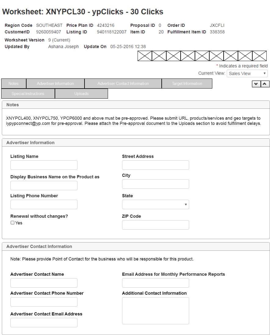
Content Collection Form helps people capture and work with information through web forms. For example, when a sales representative retires a contract, he submits an order request and sends it to order validation team for validation. Once passes, the fulfillment team would receive an order to fulfill the item and all content-relate information will be added to the Content Collection Form. The sales rep will receive a notice once the order is completed.
Design Process
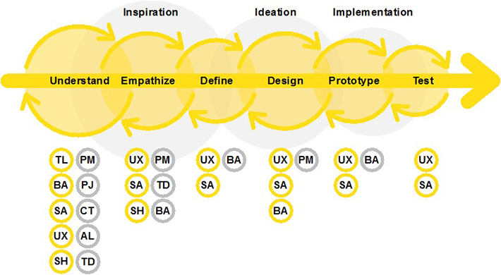
Understand
- Who are the users?
- What are the pain points?
- Review data
- Define research strategy and baseline metrics.
I discussed with stakeholders to reach a consensus on “what is the problem we are trying to solve?”
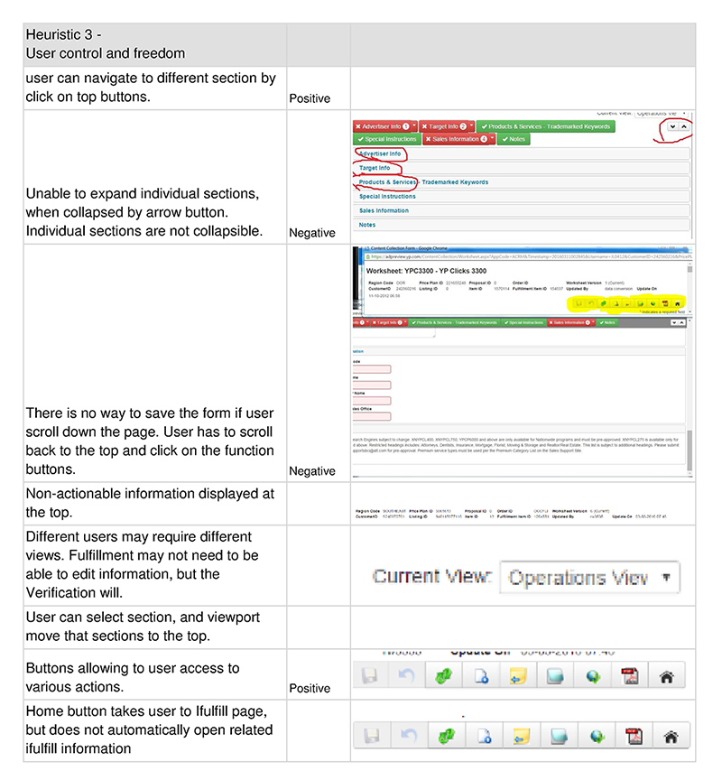
Heuristic Evaluation
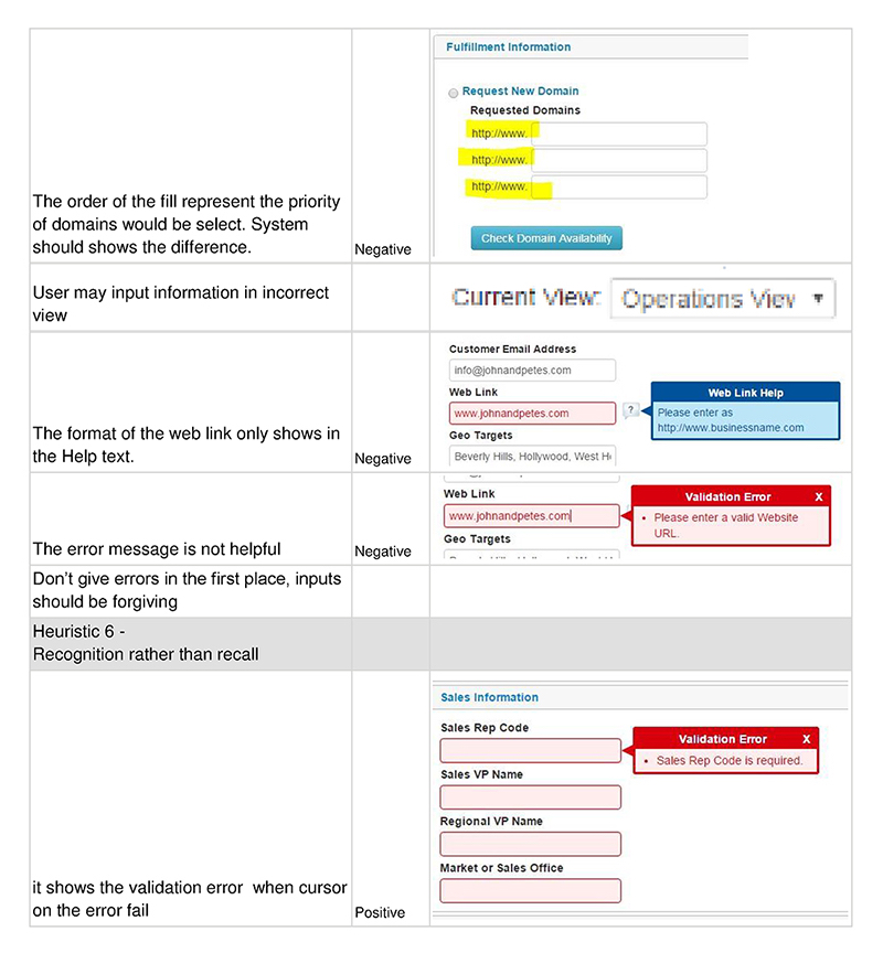
Utilized Nielsen's 10 general principles to uncovered several issues in the forms. I worked with another designer on the Heuristic Evaluation individually, we performed the evaluation at the same time and combining findings later. In order to analyze the findings, we grouped similar violations into the same group of problem. For each of the problems, we scored them from 1 to 10 by 2 aspects. The SEVERITY of each problem and the DIFFICULTY to resolve problem. The most serious but less difficult problems were our first priority. During this process numerous further problems were brought to light.
Contextual Interviews
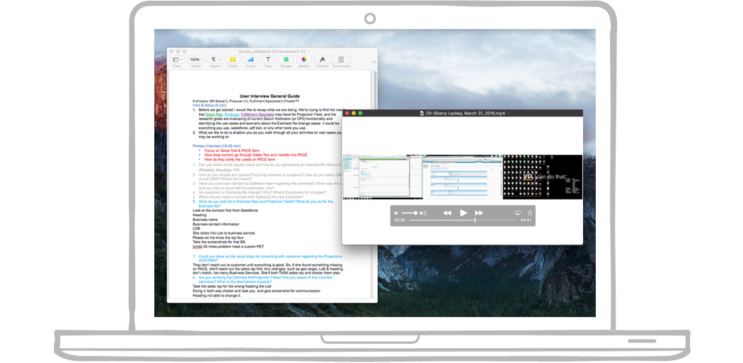
In order to understand users and their current work process, we conducted 30 interviews. Users were selected based on their involvement in different business processes and different products. For example, a high volume query who spends several hours every day dealing with order requests, or a user who tracks website fulfillment status once a week.
What are the problems?
- Confusing navigation
- Uncertainty in what should be filled in the fields
- Content is always wrong or missing
- Requirements aren't obvious
- Unclear error message and verbiage
- Order query rates are too high
These issues led to a serious consequence - Clients are unhappy with the content YP designed. I also got feedbacks from numerous users that they don't know what to do with the forms, and they see little or no value in it.
Ideation
Define & Prioritizing Issues
- Focused on user roles in company, current behavior, and pain points on the work process.
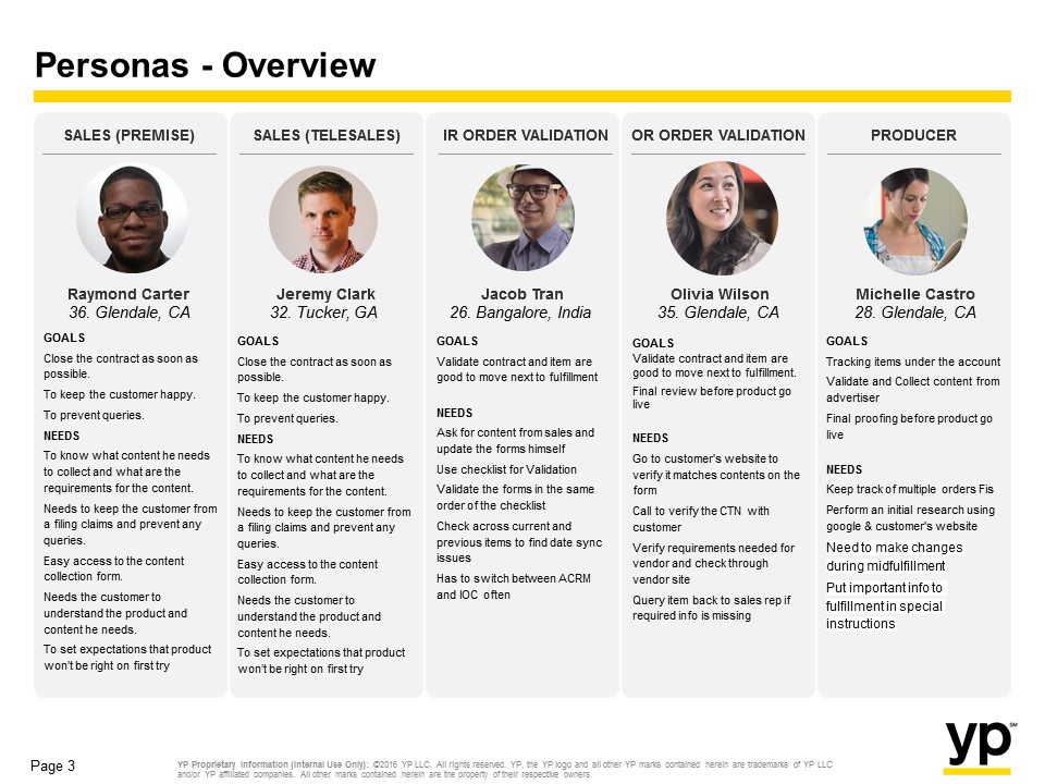
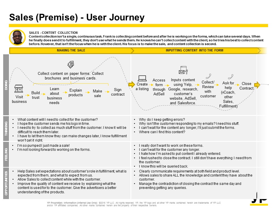
- Generating user journey and user personas based on different roles such as Sales Rep, Producer, Designer, and Proofer.
- Identified opportunities for design exploration and quick fixes.
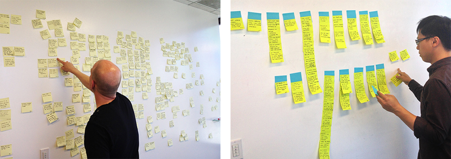
Synthesized 300+ interview notes into themes and insights through Affinity Diagram.
This encouraged us to focus on developing user-centered solutions rather than letting our own assumptions guide the design process.
User Journey & Persona
The user flow allowed us to view the details and specifics of individual interactions. In combination with the user journey and user personas, we were ready to ideate solutions.
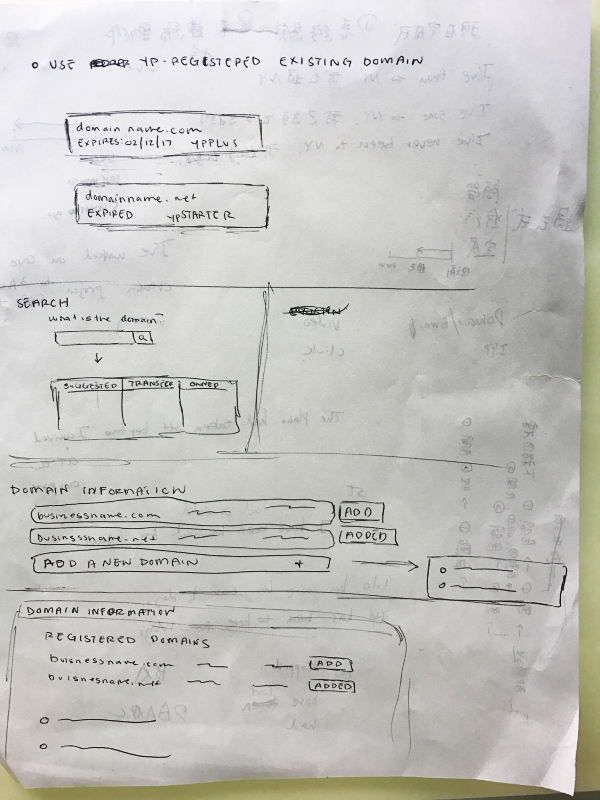
Concepts
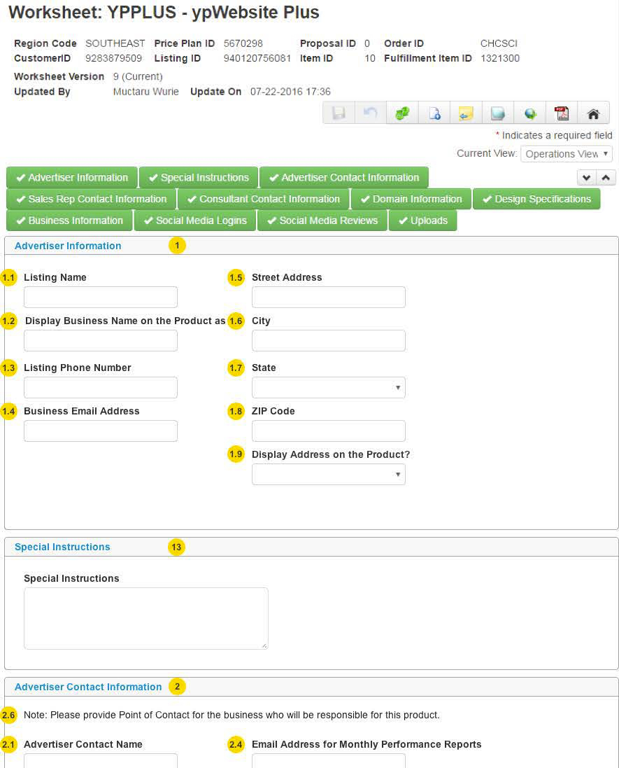
Then I started to sketch lo-fi wireframes and made them into paper prototypes. Having my first series of lo-fi wireframes, I thought it’s a good time to present to the whole team, especially to systems admins. Over the course of my experience, I found this effective to present to developers and admins early in the process when the fidelity is still low because I can benefit a lot from their feedback related feasibility and performance.
- What could it be?
- How Might We…?
- Create conceptual wireframes and experiments.
- Refine selected designs.
Wireframes & Mockups
- Lo-fidelity to High-fidelity.
- Designed testing strategy to verify metrics.
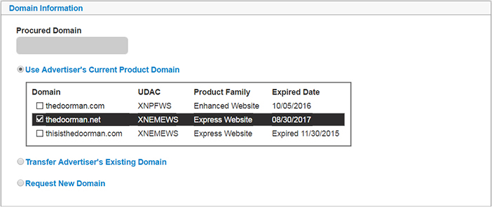
- Provided prototype with the functional specification to illustrate the look & feel guidance for the developers.
I have used a wide range of tools. Axure is my specialty, but we’ve also used Balsamiq, Visio, PowerPoint, and HTML prototyping methods.
Implementation
Usability Testing
- Proved our concept with a prototype.
- Executed user testing and collected user feedback.
- Iterated and continuous improvement.
Design Deliverables
- Business requirements.
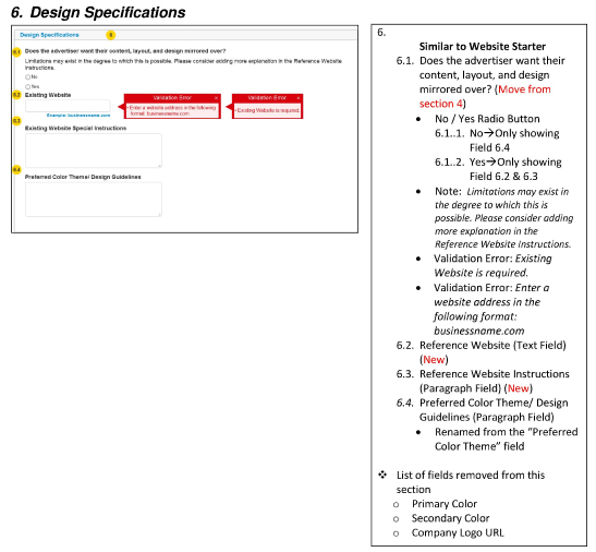
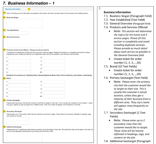
- Design specifications and wireframes.
- Functional specifications and technical requirements.
- New Jira work request ticket to developers.
Outcome
The improvements released by the end of August 2016. The query rate of 3 products dramatically dropped within a month.
Reduced Query Rate
- ypWebsite: 82%→33%
- ypClicks: 36%→12%
- ypVideo: 24%→16%
Standardized Forms for Sales Reps' Accurate Initial Completion
- Layout
- Labels
- Terms
- Textfields validation
- Error messages
The streamlined new design optimized business and internal user flows by aligning user goals, research findings, and effective cross-functional communication. This resulted in improvements in YP ad fulfillment quality and processing time, culminating in a more efficient overall process.
YP continues to enhance the platform. Customer success is a key mission for YP Advertising, and the Content Collection Form and the Fulfillment Platform play critical roles.