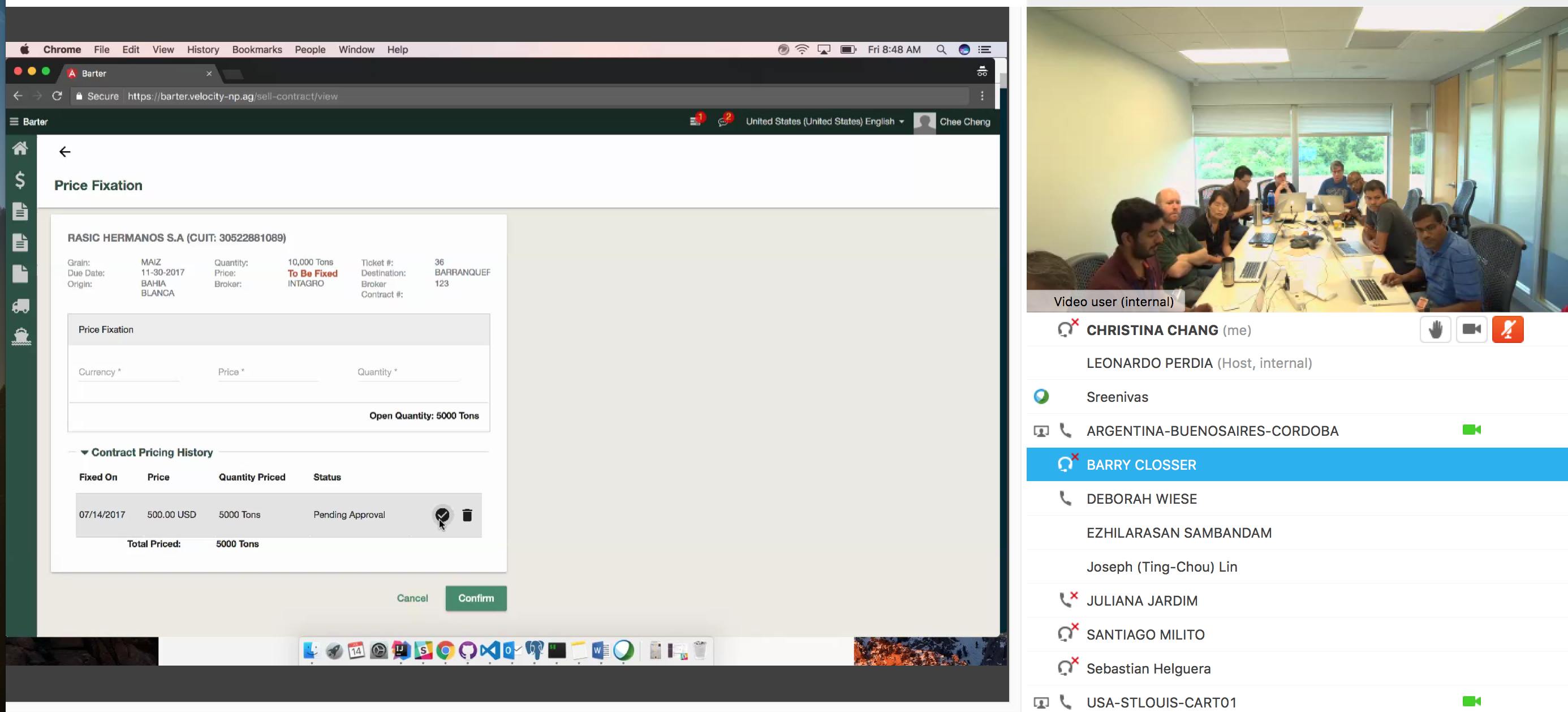
Monsanto Barter System
A great experience to work on project considering globalize strategy. I was responsible for the UX research and product design process. Design methods included User Research, Journey Mapping, Wireframing and Usability Testing.
| DESIGN TOOL | SCOPE | DURATION |
| Axure | Web App | 12 Months |
|---|
Argentina manages more than $300M of barter sales annually. Replacing manual sale operations with automated processes will significantly enhance productivity and eliminate errors that associated with checking and re-entering data from different systems.
Developing a new Barter Finance System with automatic process will contribute not only a better Custormer Experience but also an annual saving of $280K on service.
Discover
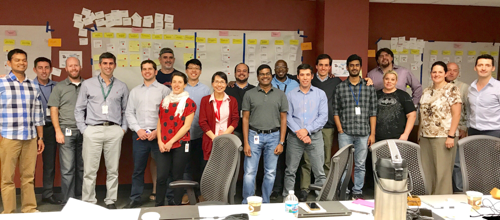
We had 2 workshops in both Argentina and the United States to meet with our partners across Monsanto to understand target users, user needs, product capabilities, and business values.
Kick-off Workshop
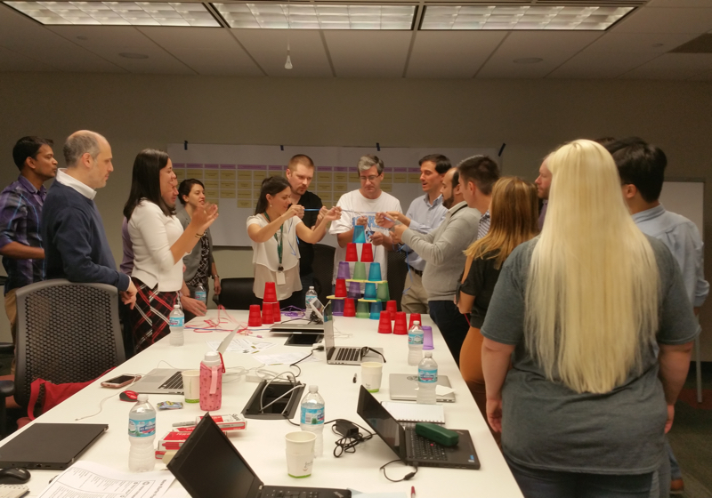
It was organized by Product Owners, Project Managers and UX teams. It helped us get to know each other and broke the ice. In order to get the stakeholders and the design team on the same page, I walked over the human-centered design process, established design expectation, and explained challenges we had faced with the entire team. At the end of the workshop, we had a high level of understanding:
- Current process and pain points
- Different business process in each of the markets (Argentina, Brazil, and the US)
- Which needs does the product fulfill?
- How will this product benifit company?
- Product vision
- Product's MVP
- Working agreement and next steps
2nd Workshop (5 days)
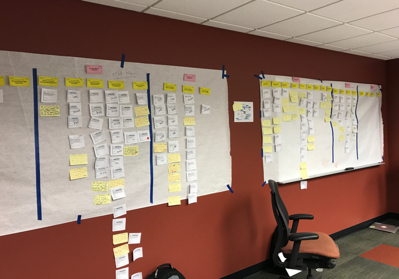
Workshop was completed in St. Louis with Business and the US development teams. In the workshop, we went through the themes, the epics and the user stories. After that, Business prioritized the user stories based on business value and the scrum teams estimated stories by complexity. Last, Product Management team came up with forecasts.
Define
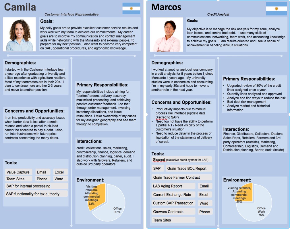
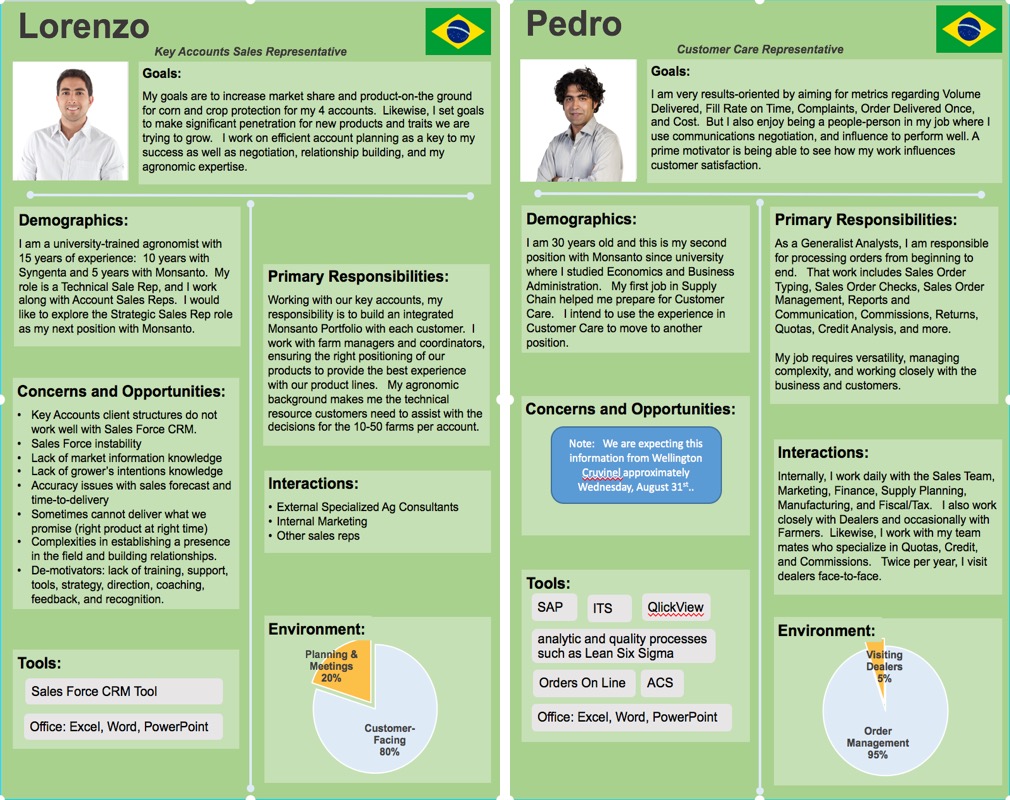
Persona was one of the outputs from the workshop. I broke the Barter process down into smaller, more manageable tasks. As we were coming up with ideas, stay focused on the needs and desires of the Buy & Sell process for the internal users.
External Users
Farmer, Dealer, Exporter, etc.
Internal Users
Back Office, Account Manager, Credit Analyst, Grain Trader, etc.
Internal and external users shared similar tasks but pursued different goals. Back office users, consisting of administrators and support personnel, did not directly interact with clients.
Primary Tasks
- Contract Creation
- Marketing Campaign
- Contract Management
- Price Management
- Grain Delivery
- Inventory Management
For each tasks, we debated how desirable it was and how true it was to our persona. For example, we decided that it would be much more approachable and desirable to provide concise exchange rates explanations of grain delivery in addition to the tables.
Ideate
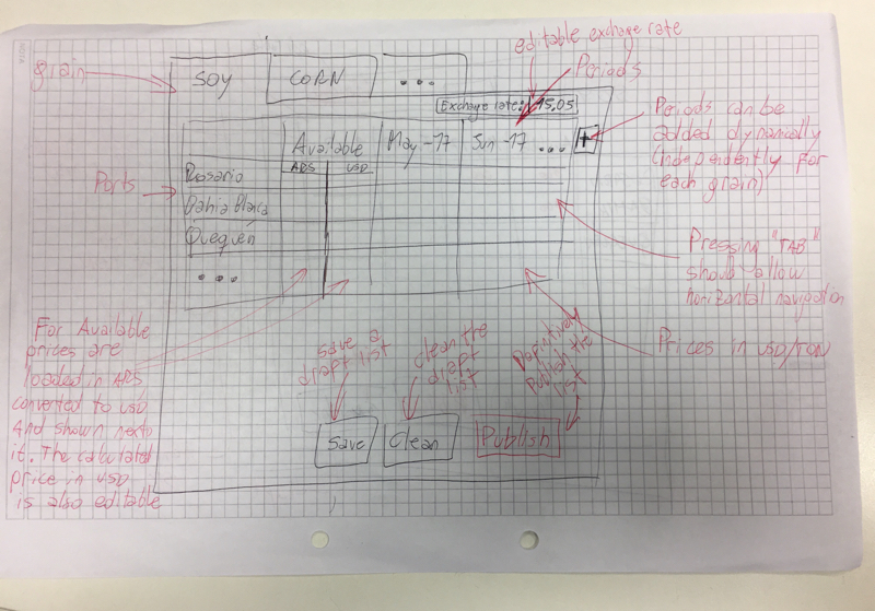
I saw opportunities and insights from the workshops. According to the information I collected, I can produced numbers of inexpensive designs to communicate my ideas. Furthermore, I added my clarification for each of the features or the specific functions that I want to emphasize.
Great designs will never be created overnight. I always gathered design feedbacks from different stakeholders. Designs and prototypes were shared and tested within the design teams, or on a small group of people outside the design team (both business & devs).
Prototype
Wireframes & Mockups
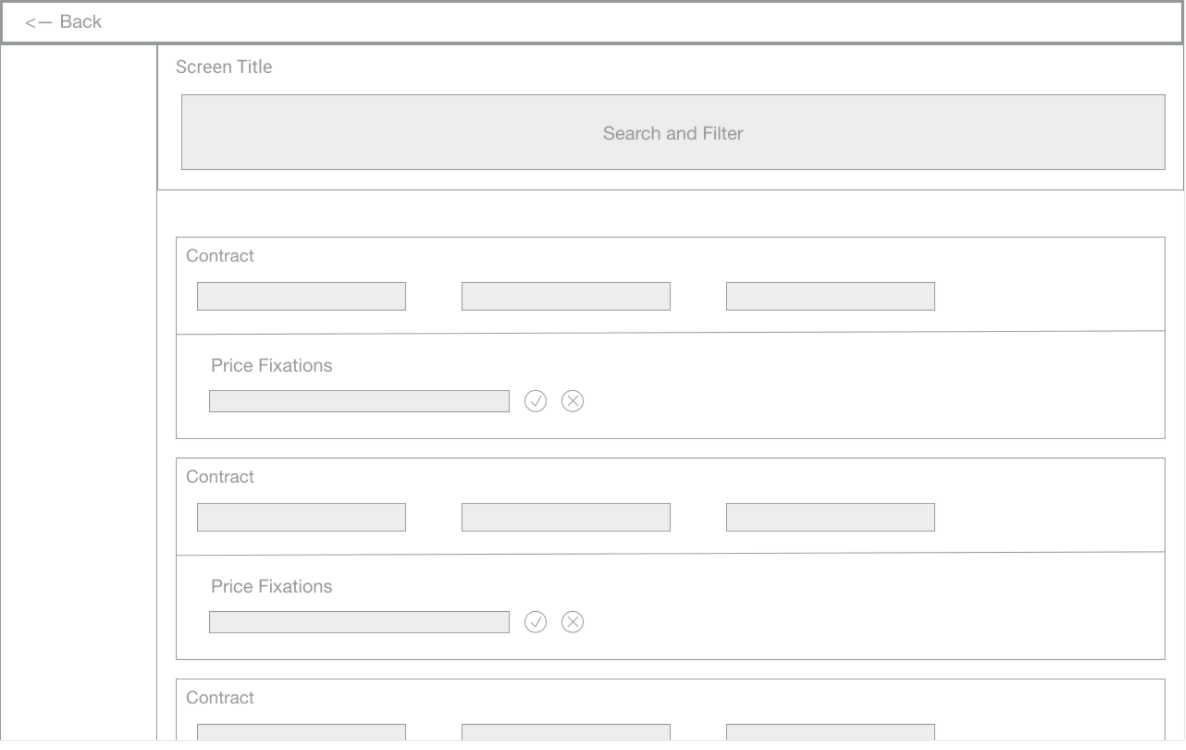
Design iterations started from white boarding and low fidelity mockups to mid fidelity mockups. The choice of designs varies depending on the goal of mockups.
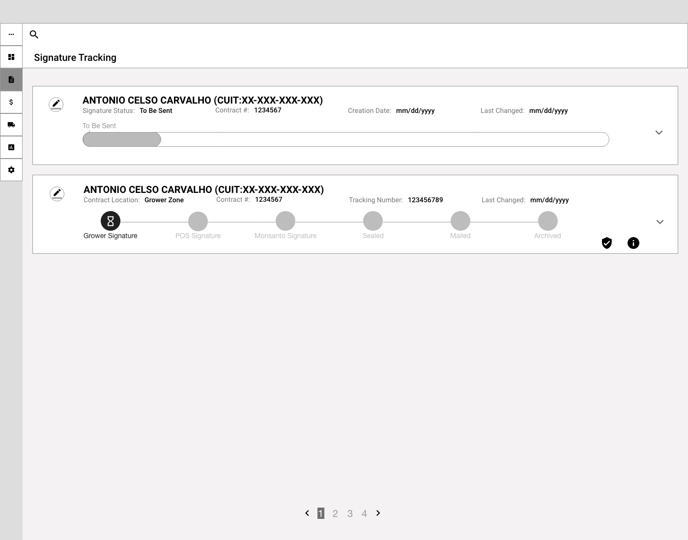
This is an example I created to verify if these two type of contract status bars are clear to the users. Different type of contracts have differnt process, so I utilized the mid-fi wireframe to verify if internal users are able to make actions according to the contrat status. Also, I worked with the development team on checking if the SAP system can support the design.
Hi-Fi / Interactive Prototypes
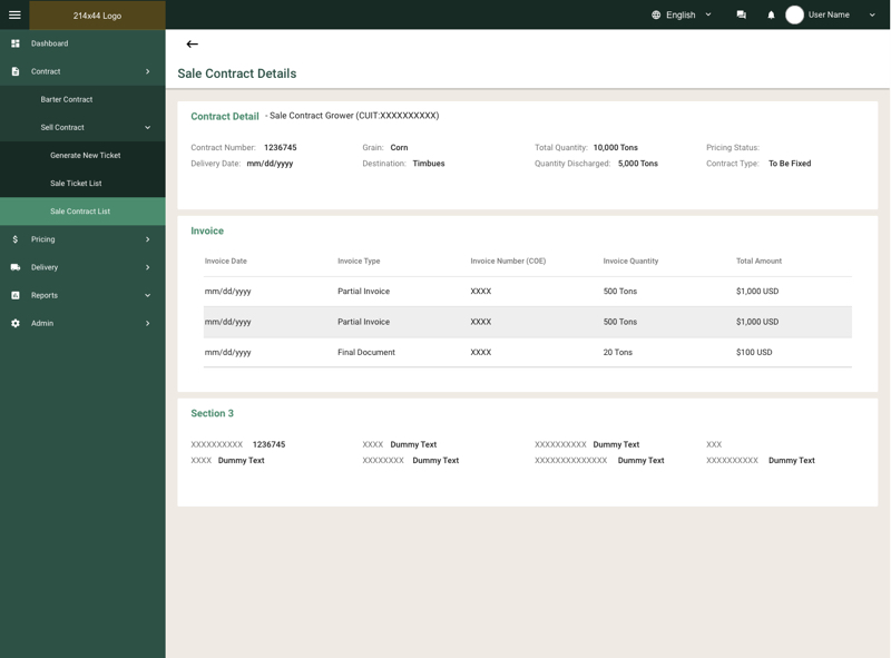
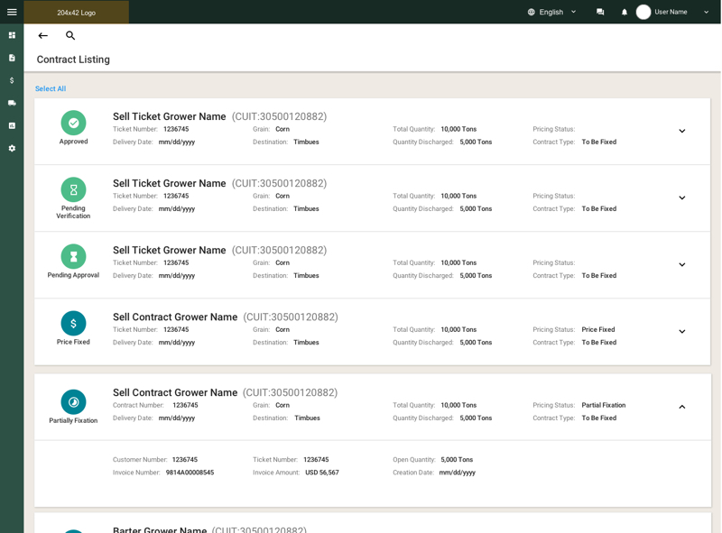
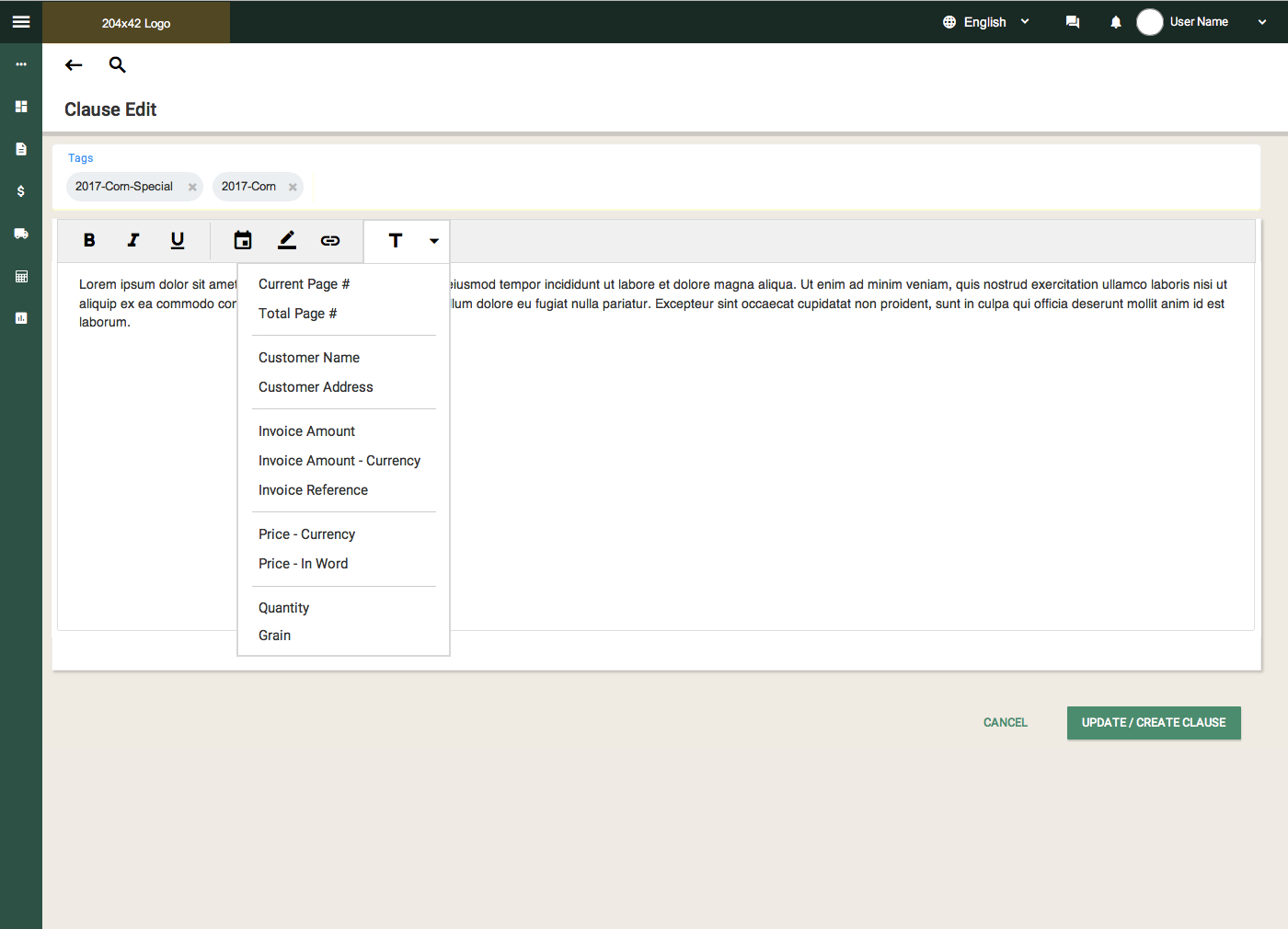
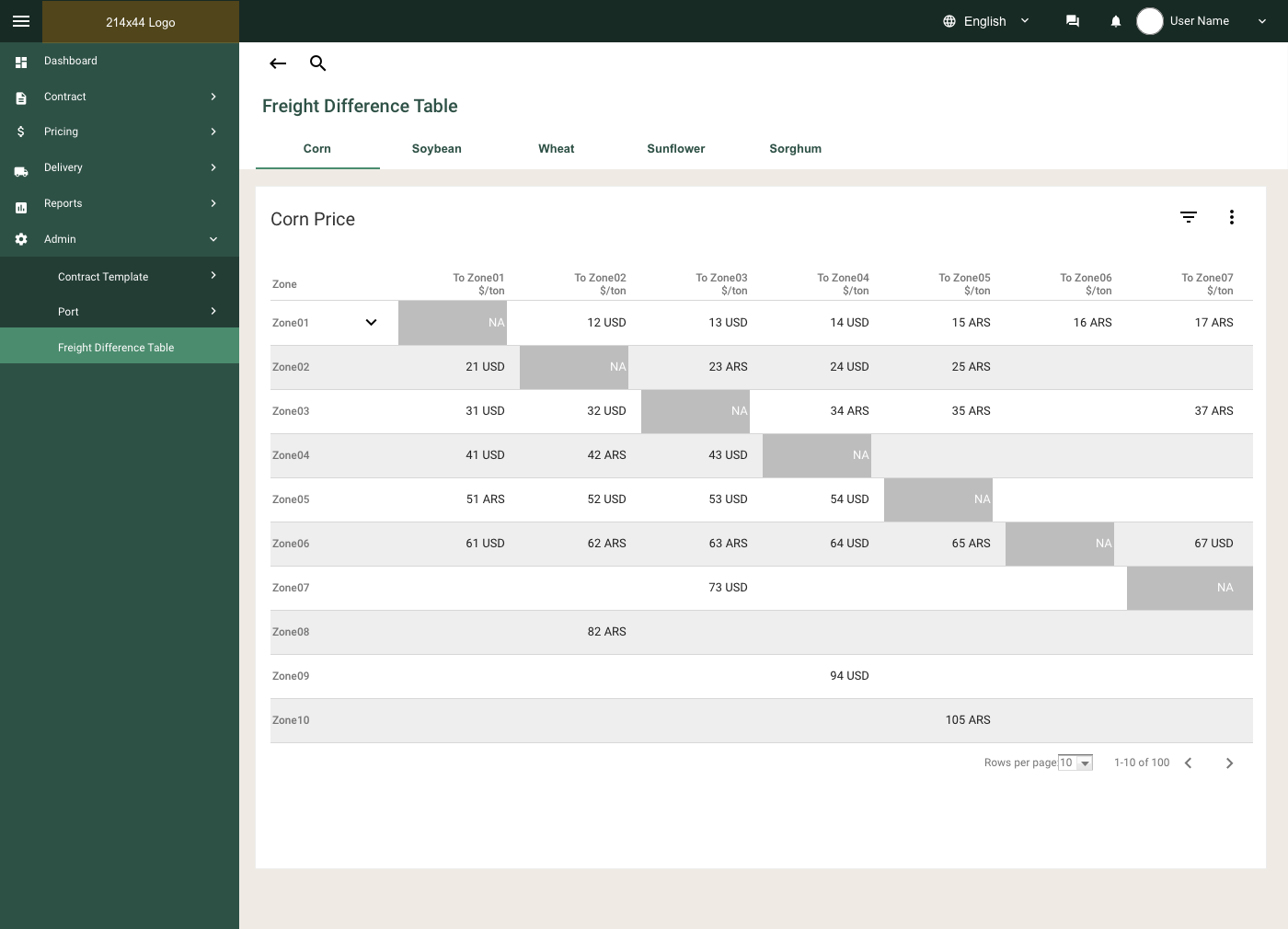
I used Skecth, Axure and Invision. I created high fidelity designs while ideas becoming solid and mature. In addition, if I needed to validate design concerns by user testing, I would also create hi-fi designs.
Build in Agile
Developers easily only focus on creating and delivering working products. Many developement teams often think UX to be siloed and difficult to collaborate with. In order to incorporate UX and Product Design into agile, I've spent a lot of efforts in ensuring UI consistency and clever UX across 5 scrum teams.
As a Product Designer in an Agile team, I did not operate in a vacuum. I interacted with business stakeholders on a regular basis to infuse the development process with business priorities and domain expertise. Inviting stakeholders to brainstorm about features, functionality or user-friendly solutions introduced fresh ideas and insights. It’s important to note that stakeholders did not just tell us what to do but, instead, were invited guests in the Agile team’s war room.
