Access Management Platform (AMP)
Things kicked off when the U.S. government tightened the screws on overseeing user data on social media. Meta needed to enhance its security to secure user privacy better. We built AMP to provide a straightforward tool for internal security devs to manage data. It provided a unified experience managing 8000+ tools and increased productivity for 13,000+ Meta employees.
| SCOPE | DURATION | TEAM SIZE |
| Web App | 6 Months | 6 DEVs, 1 TPM, 1 PD |
|---|
Problem
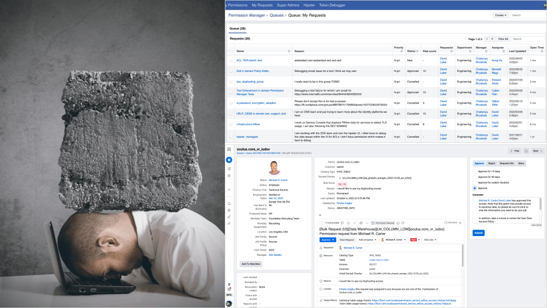
Meta's internal security developers were swamped with the burdensome task of managing data. Tasks like sorting out who gets access, improving data quality, and 24/7 resource monitoring turned into real headaches. These problems slowed things down and, more importantly, posed risks to billions of user privacy.
Problem Analysis
Permission Manager (for internal tools) and Hipster (for all others) were the primary access management systems that controlled access to tens of millions of production assets by Meta employees. Meta's tools and services were used to develop secure software and keep Meta users' data safe, and they had a direct impact on the productivity of all Meta developers and employees.
So...
How Might We assist access managers in reducing time & effort managing, so the access requesters don't get blocked in a workflow?
My Role
As many members of the team were new to working with a designer, I took on multiple roles in the project. I established the product design strategy and led the end-to-end experience design with the team. My responsibilities included creating wireframes, designing screen flows, developing interactions and visuals, and managing the rollout schedule as a product manager.
User
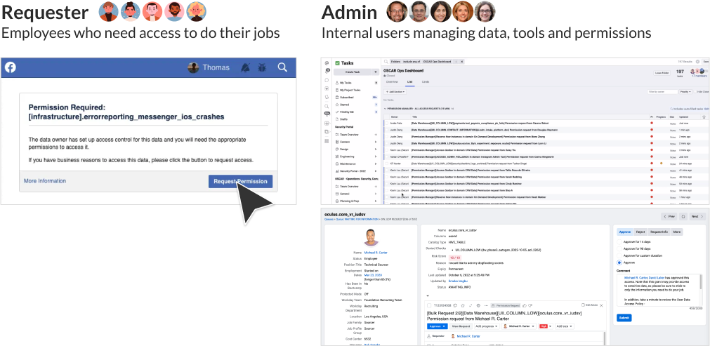
We divided users into Requester and Maintainer roles, as the platform serves two different types of needs. Requesters could be any Meta employees, and Maintainers could be oncall devs manage tools or data assets. When requesters are blocked out and submit permission requests to do their jobs, tasks are generated and routed based on types of data and the requesters' role.
Challenge
I faced three challenges in this case:
- These domains were very technical, designed primarily for Security Engineers to manage sensitive data, involving a lot of unknown use cases and thousands of internal roles.
- We didn't have a clear picture of who our users were, no roadmaps to guide us; lack of data to inform our decisions.
- Many team members were unfamiliar with HCD process and had not teamed up with UX folks, I also served as a design thinking facilitator.
Solution
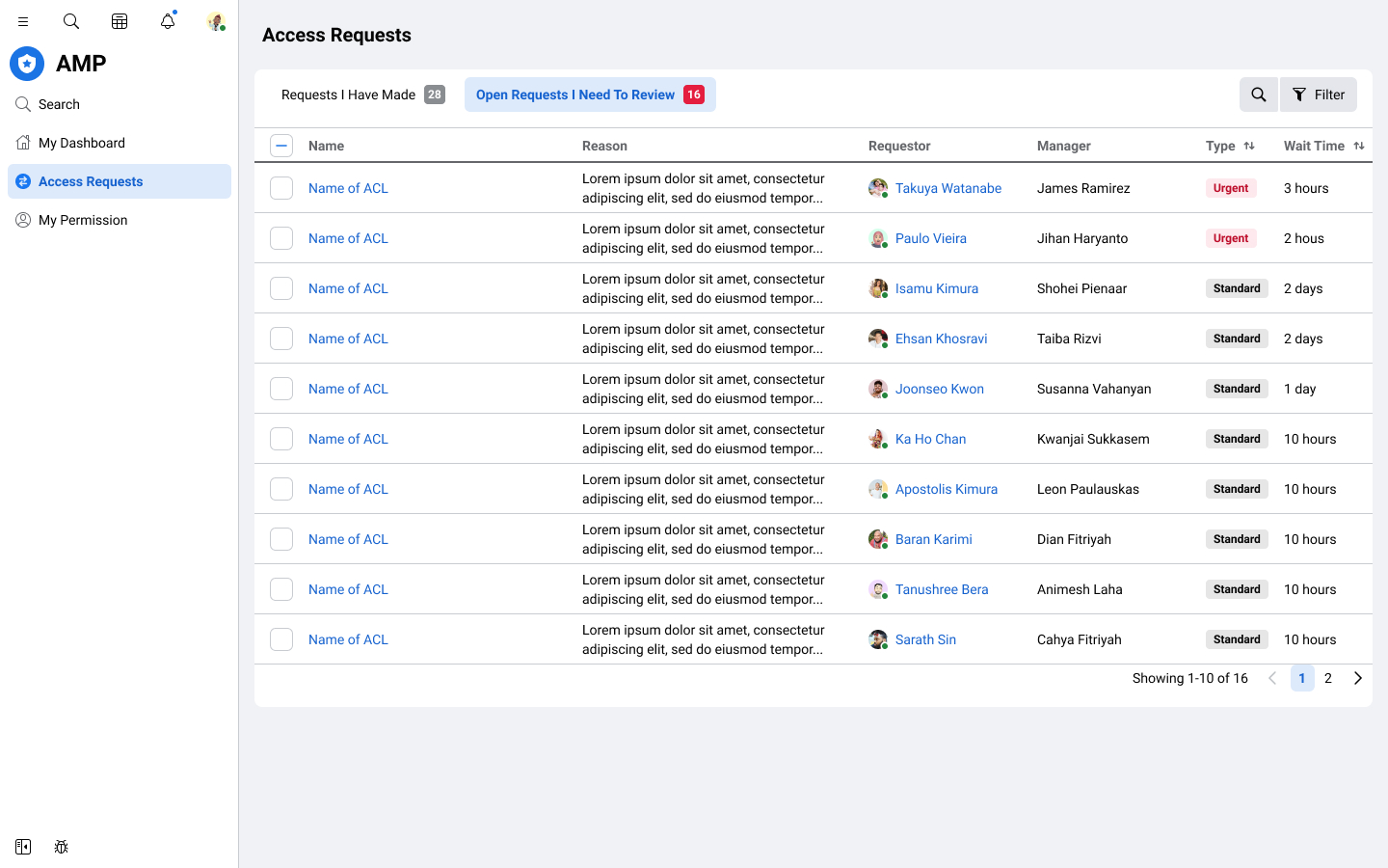
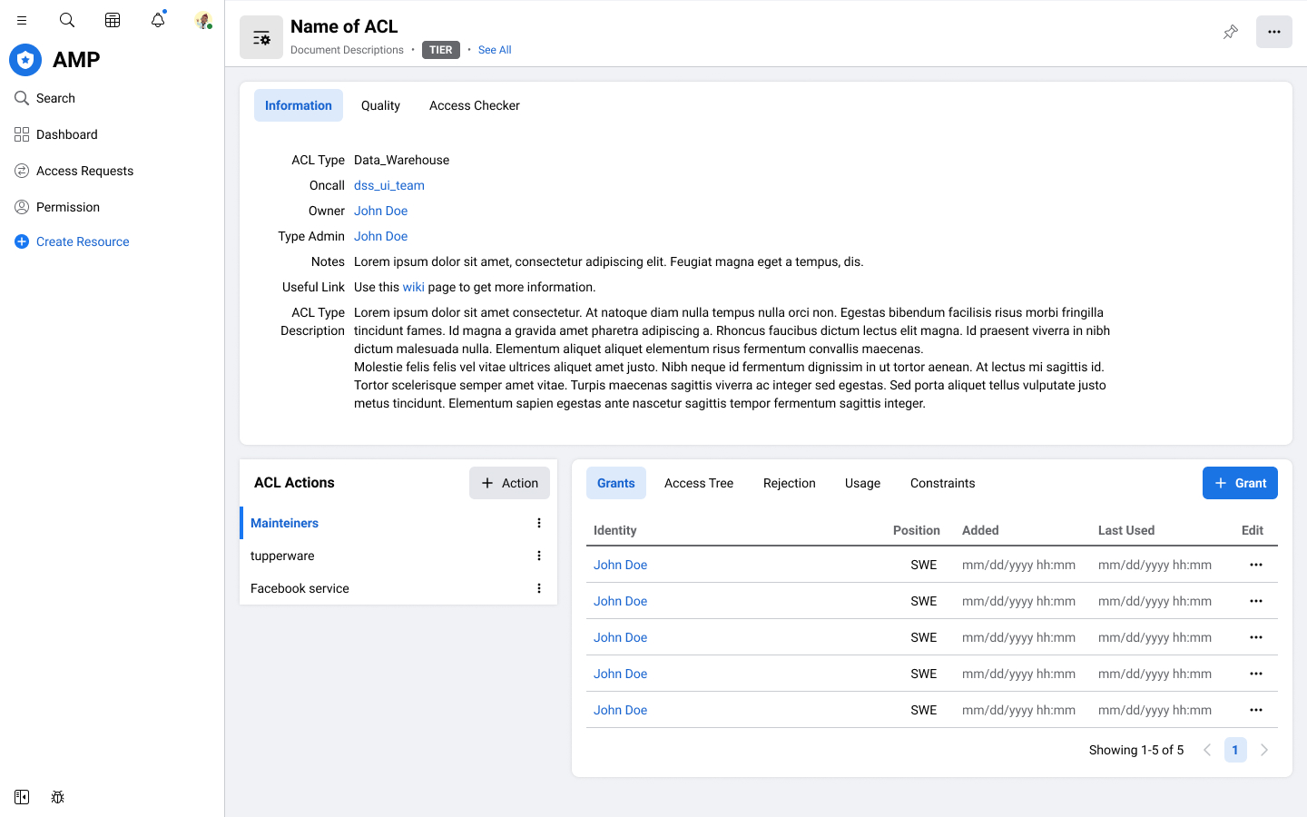
We built a new platform empowered admins to easily track data status, and remediate issues across a large set of data. It provided a seamless experience increasing productivity for over 13,000 employees in managing over 8,000 internal tools. Our team aimed to complete this over the next 2-3 years.

Approaches
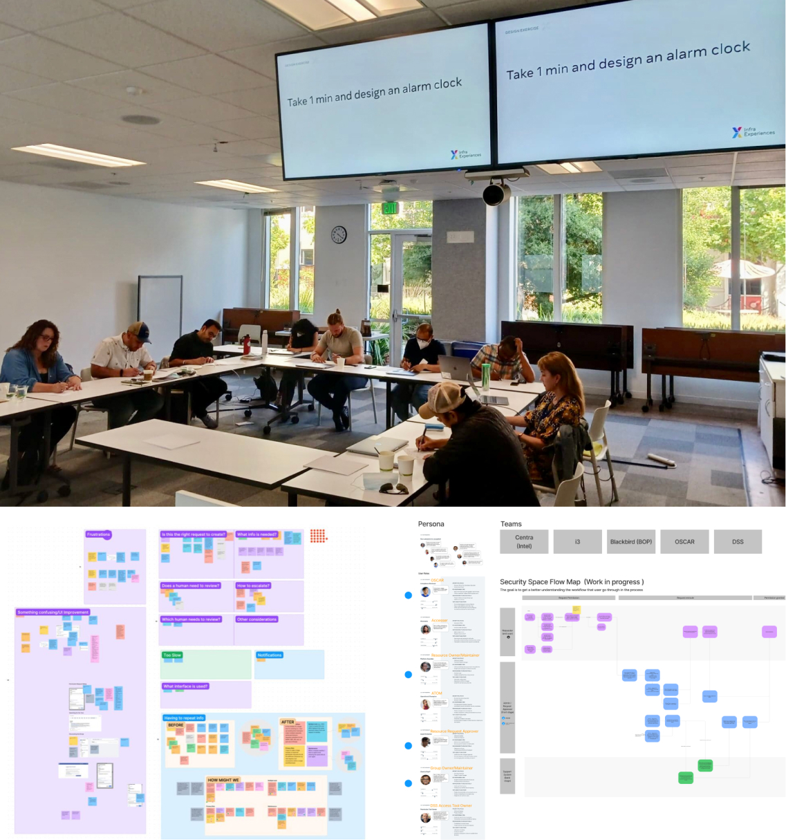
I organized and facilitated a two-day workshop at Meta's Menlo Park headquarters in collaboration with a UXR and a TPM. During these cross-functional workshops, we conducted activities like Dogfooding sessions, Persona discussions, and Journey Mapping. The picture was taken when I led a Design Thinking exercise attended by 10 team members, where I emphasized the importance of incorporating Design Thinking into our development process.
By the end, we had gathered over 150 post-it notes highlighting key pain points and challenges faced by users.
“Design creates culture. Culture shapes values. Values determine the future.”
Planning
I created the journey map and mapped these notes & topics onto a value/effort matrix. Then, I presented them to TPM and UXR to facilitate the roadmap breakdown into phases. Through my approach, I was able to get buy-in from team members and make team decisions together.

Design Goal
From the workshop and analyses, I used those key takeaways to shape my design goals.
UI Exploration
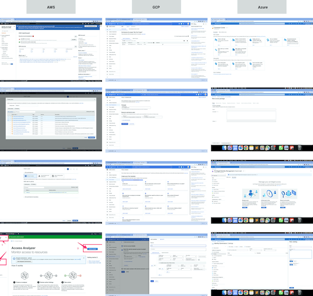
As part of the visual design phase of the redesign, I created a mood board to explore my design inspirations and to ensure that the design aligned with the Meta internal tool's pattern and style. I researched some common UI patterns from Meta internal tools and collected references from other websites such as Amazon Web Services, Google Cloud Platform, and Microsoft Azure. It helped me to understand how to craft a good experience for users of the access management workflows.
Design isn’t finished until somebody is using it.
Design Iteration
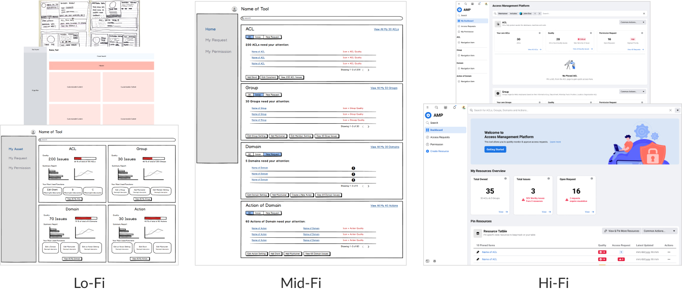
I used various visual artifacts to ensure that everyone on the team was aligned in each design phase. This method helped to spark conversations and drive alignment across teams and functions, ensuring everyone understood the design direction and goals. In addition, clarifying what the product was and wasn't intended for and our design decisions could align with our overall goals.
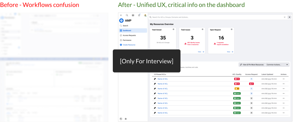
Example 1 - Dashboard
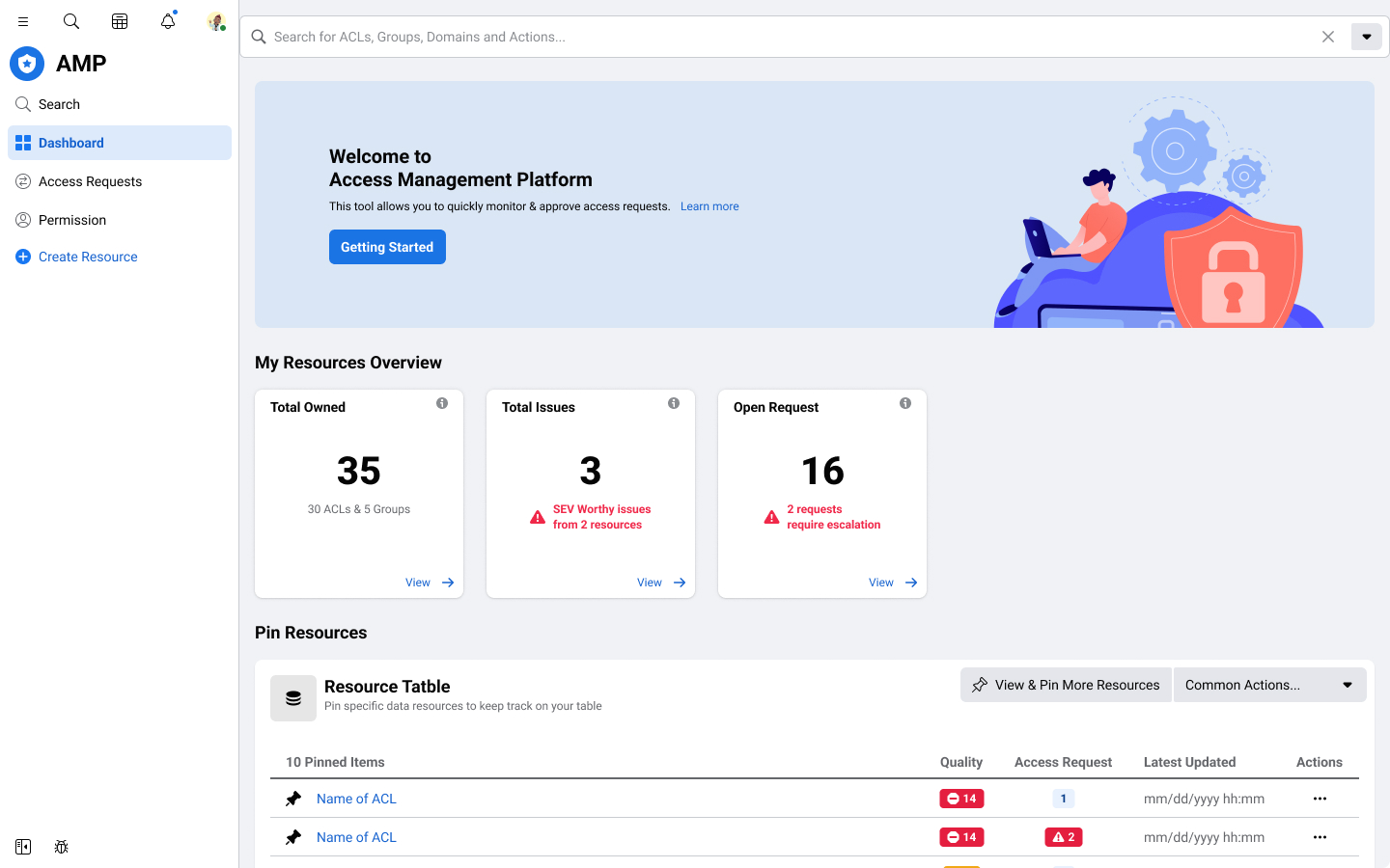
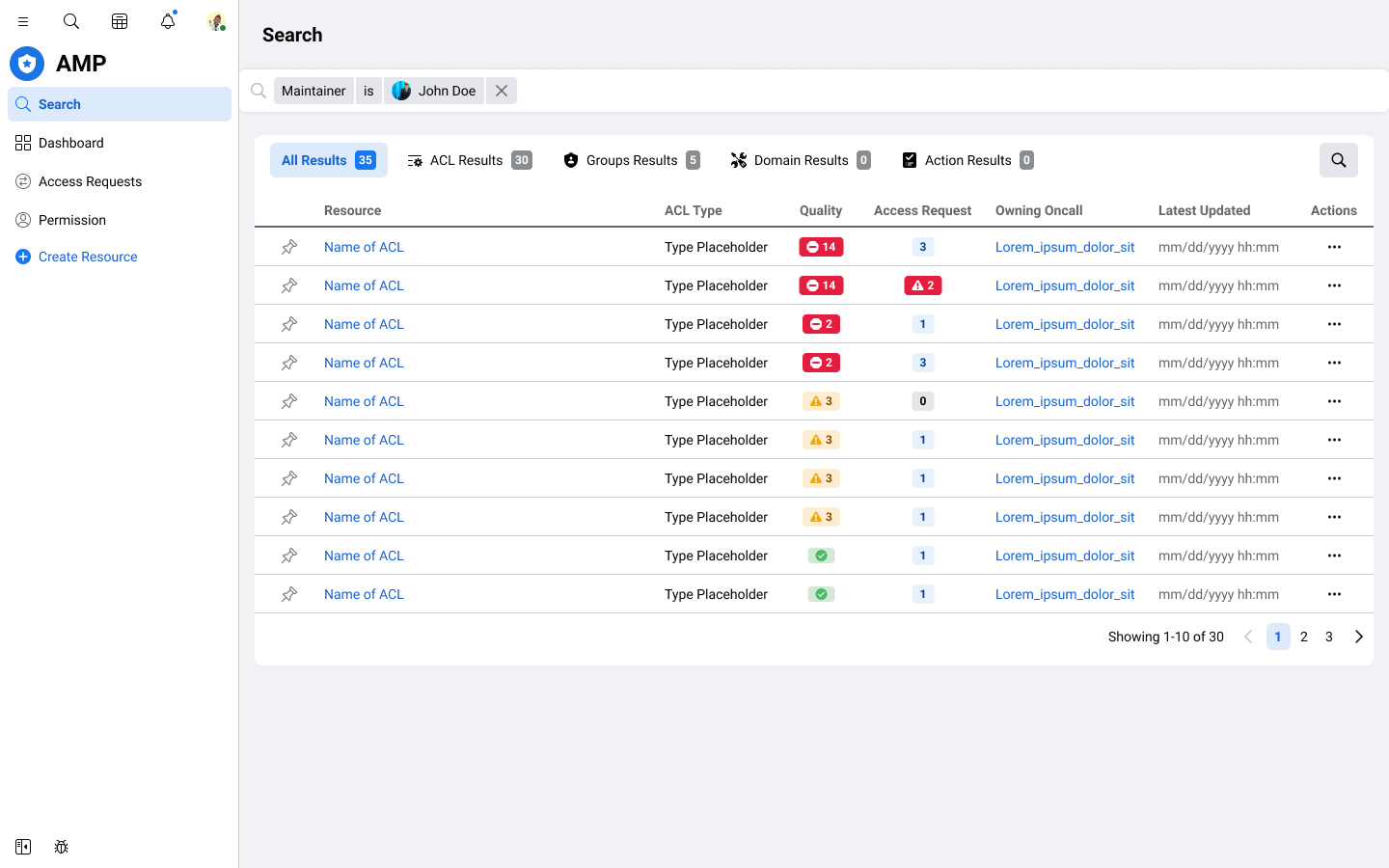
One of the usability issues I identified was that the workflows for access management tools were too different, which confused users who needed to remember which tool to use for specific assets and how to use each tool effectively in their daily work. Another issue was that asset owners and maintainers weren't tracking the status of their assets frequently or were not even knowing this information existed.
To address these issues, I created a new design that places essential information upfront on the dashboard and guides maintainers on which assets require attention and the appropriate actions to take. This resulted in a more streamlined and intuitive user experience that effectively supports maintainers to take action accordingly.
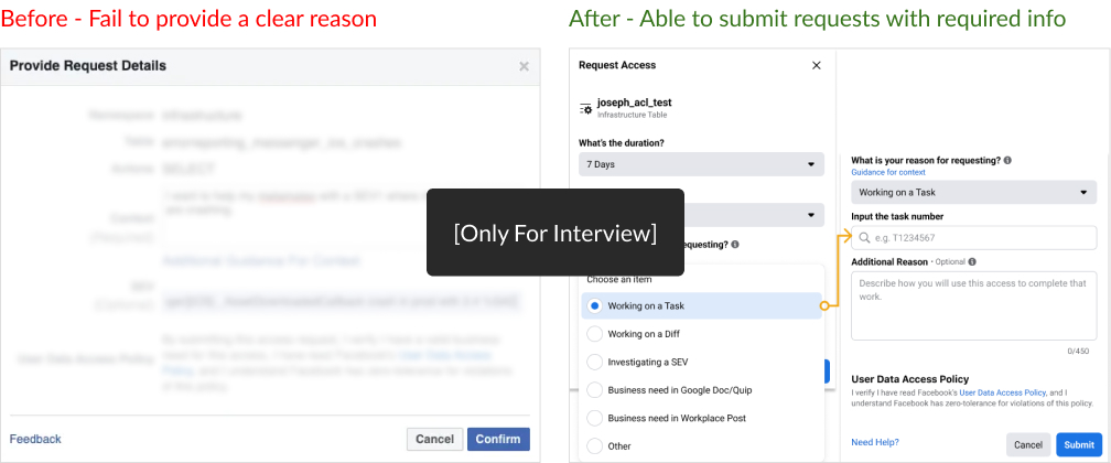
Example 2 - Requesting UI
Our research showed that the approval process was often delayed because of weak or unclear business reasons provided by the requester. It was a significant issue because it slowed down the entire workflow and created frustration for everyone involved.
To tackle this problem, I collaborated closely with the internal governance team to organize the evidence that governance users need to make decisions faster. I added clear guidance to ensure requesters include all the necessary information when submitting their requests. The new design still allows users to provide additional context if needed, but it strongly encourages them to provide the necessary evidence upfront.
As a result, we significantly reduced delays in the approval process and made the entire workflow much more efficient.
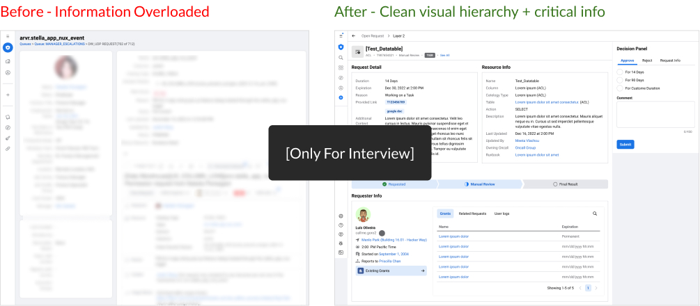
Example 3 - Reviewing Request
The 3rd example is while the maintainers reviewing the request page. Our research showed that maintainers needed more visibility into the highly relevant info and the status of the tasks they were assigned. However, the information they needed was buried in the task view, causing them to waste time scrolling and searching for key information.
To address this, I made several visual iterations, including highlighting key information and simplifying the design overall. I organized the most frequently used essential information into four sections: Request Detail, Resource Info, Status, and Requester Info. The changes made it much easier for maintainers to quickly identify the status of a request and take informed action without wasting time searching for information.
Results
Overall, my impacts and the outcomes in this case:
- The new platform simplified Admins’ workflows, making it easier to manage tools and enhancing awareness of overseeing sensitive data, which led to better protection of user privacy.
- I delivered design solutions by shaping data-driven strategy from big-picture goals down to the nitty-gritty use cases. Through the collaboration with UXRs and Data Analysts, we started seeing metrics like 'Processing Time' and 'Returning Rate' drop based on user roles.
- To make a direct impact on the design culture, I teamed up with the Engs to dig into the technical details, broke down the problem into manageable chunks, and empowered them to come up with a strategy using HCD approaches. I also initiated Design Office Hours across the entire security org with my design peers. Additionally, I was invited to give a UX Talk during the monthly town hall meetings to help Engs gain insights into UX best practices. I felt like all the hard work had paid off when I received messages from my devs that said they completely understood the story and were excited to work on the new designs.
