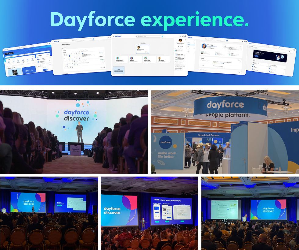
Dayforce
Making High-Density Org Charts Easier to Navigate
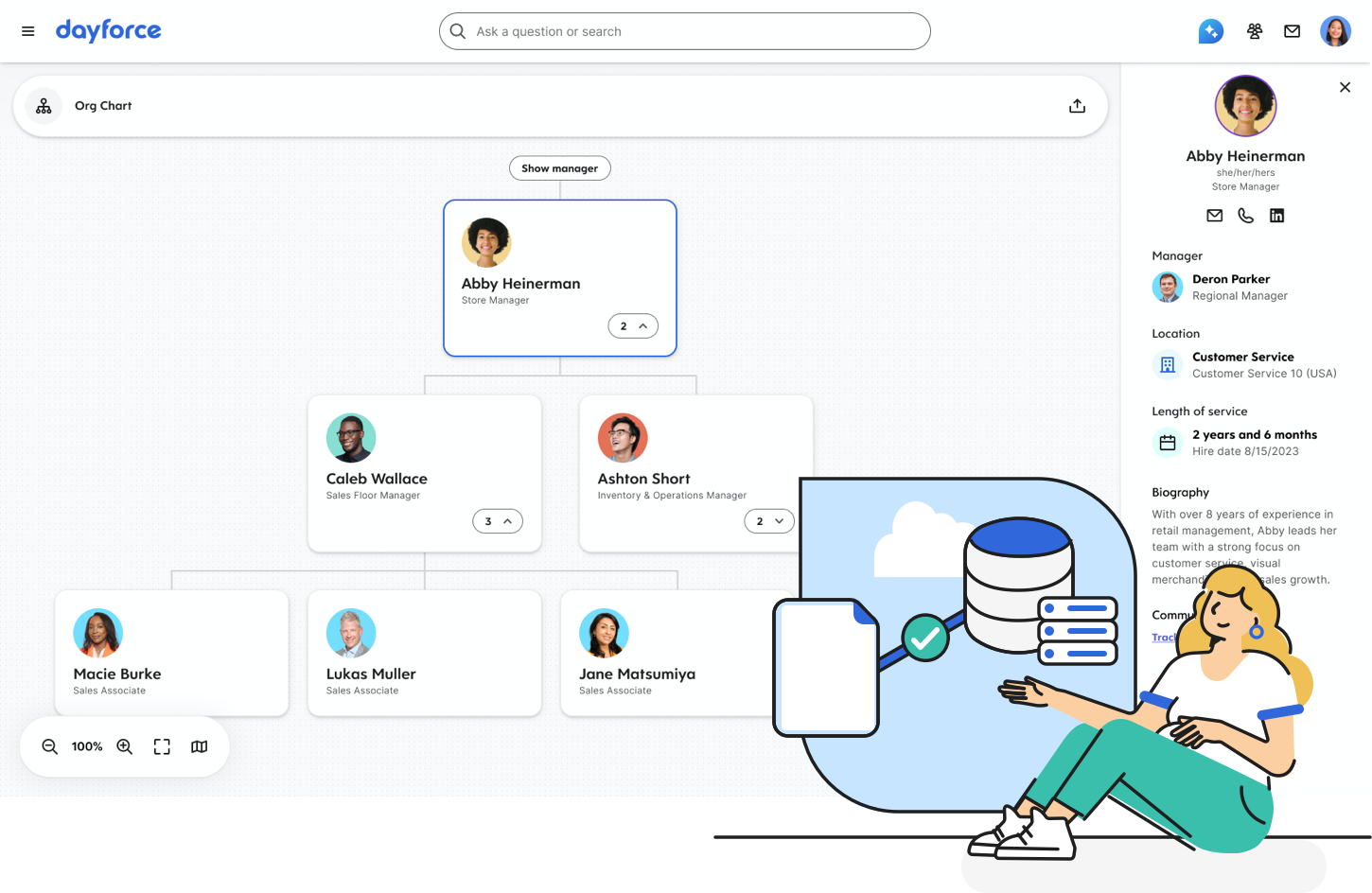
As part of Dayforce’s effort to reshape employee experiences, I led the redesign of Org Chart serving nearly 7,000 customers in 2025. The challenge was to make complex organizational structures easier to scan, navigate, and understand for employees, managers, and HR admins.
| SCOPE | DURATION | TEAM SIZE |
| Web app | 6 Months | 5 DEVs, 2 PM, 1 PD |
|---|
My Role
I owned the Org Chart redesign from definition through delivery, leading the end-to-end UX process in an ambiguous problem space and aligning global stakeholders across distributed teams.

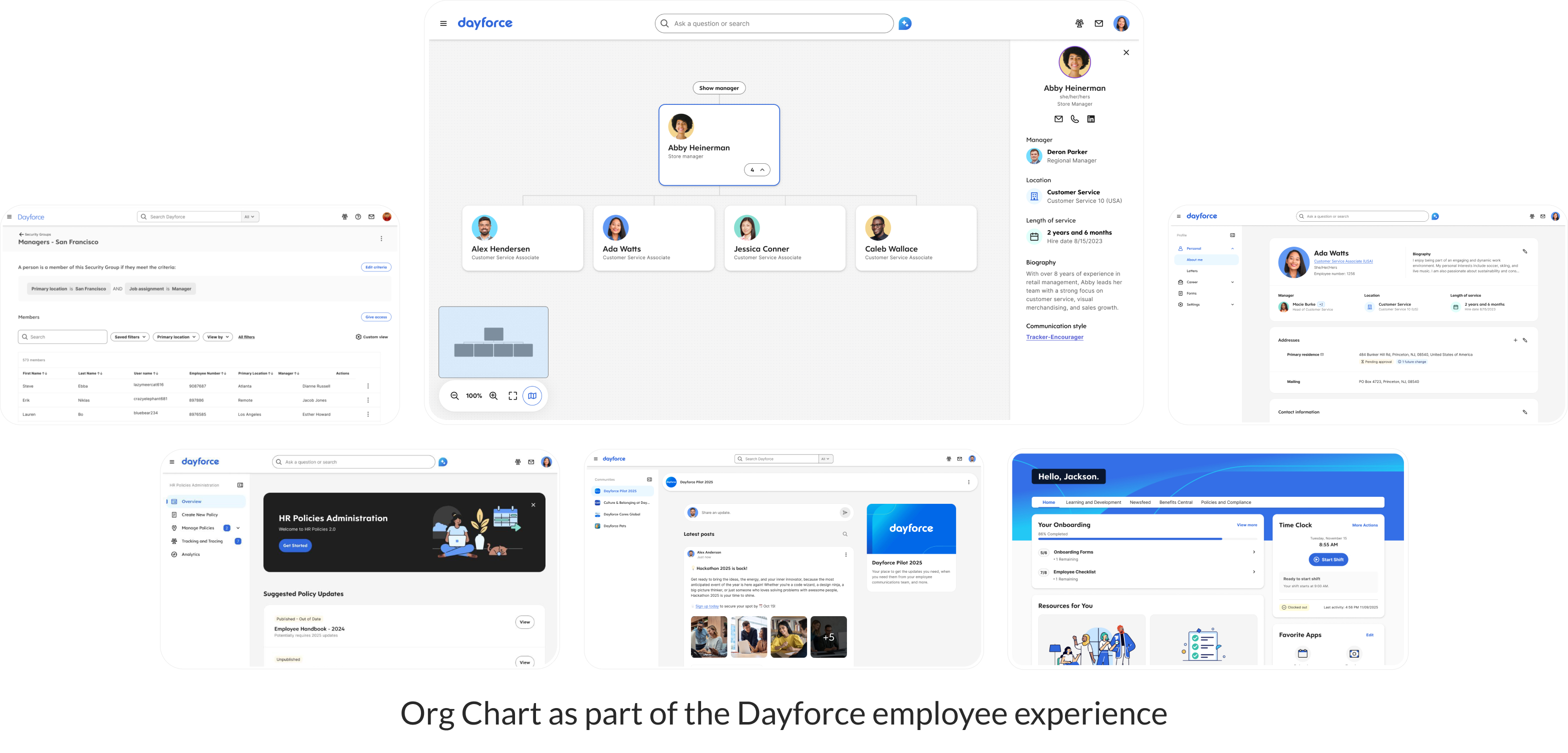
Org Chart in the Dayforce Platform
Dayforce is an HCM platform supporting employee lifecycle management across onboarding, workforce management, and payroll. Org Chart helps managers and employees understand reporting relationships and team structures across the organization. As organizations grow more complex, the experience needs to be easy to scan, navigate, and explore.
Why This Work Mattered
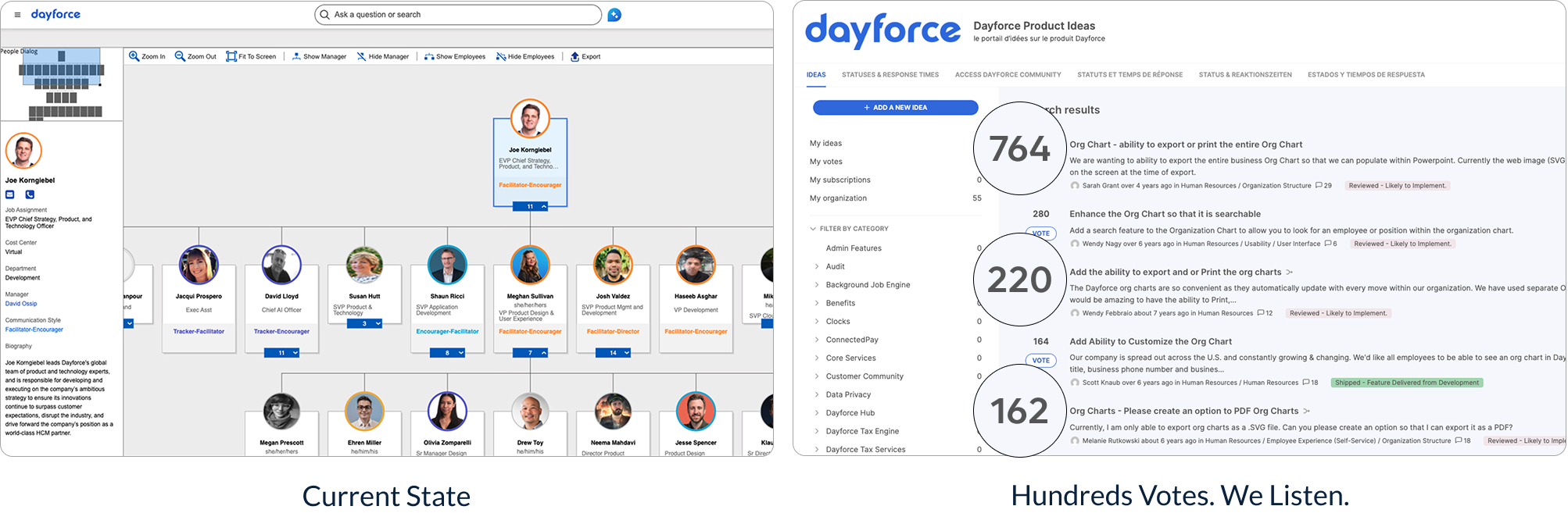
Users struggled to understand team structures and navigate large organizations efficiently. Feedback from HR admins pointed to recurring friction around reporting relationships, colleague discovery, and org navigation. In some cases, users turned to third-party tools to fill those gaps.
Finding the Key Problems
Research and heuristic evaluation revealed key usability gaps in the Org Chart. Users lost context easily, and cluttered, fragmented interactions made org structures hard to scan, navigate, and understand.
These issues affected different users in different ways:
- Employees → find colleagues
- Managers → gain visibility to team structures
- HR admins → support data accuracy, audit readiness, and configuration tasks
Together, these insights pointed to a clearer design opportunity: simplify navigation, clarify hierarchy, and make organizational information easier to understand.
Making Difficult Tradeoffs
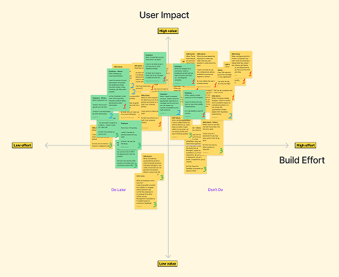
With a tight timeline ahead of the 2025 Discover launch, the redesign had to focus on the highest-impact improvements that could be delivered within product and technical constraints.
- Scope prioritization → Research surfaced strong HR admin needs, but the work prioritized employees and managers as the largest user group, while still addressing core accessibility gaps.
- Design system constraints → Rather than introducing new interaction patterns, the redesign improved clarity and navigation within the limits of the existing design system.
- Delivery continuity → PM transitions and a cross-country engineering handoff made clear documentation and shared alignment essential to maintaining design continuity.
These tradeoffs kept the focus on meaningful improvements for launch while setting a stronger foundation for future iterations.
Key Design Decisions
While I led the Org Chart experience, I collaborated with a Senior Product Design Architect and a Lead Accessibility Designer to refine the employee card, improving hierarchy clarity and navigation across the Dayforce platform.
Decision 1 - Unifying Navigation and Orientation
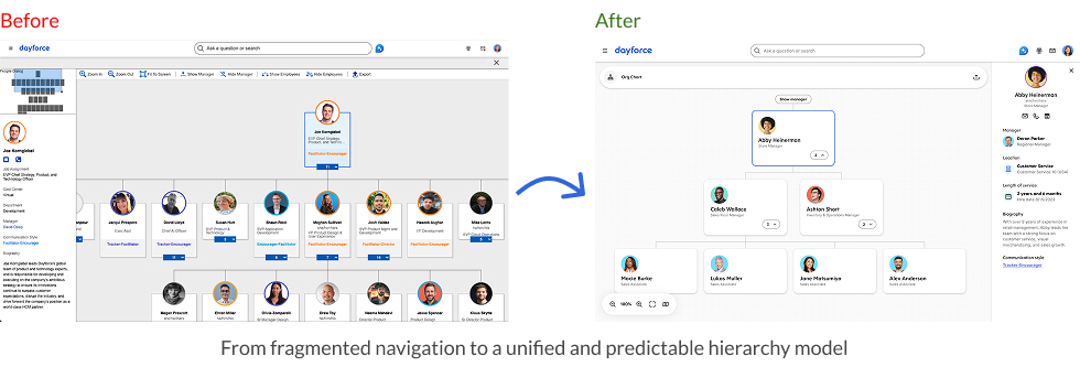
I unified navigation by consolidating canvas controls, repositioning the profile panel, and introducing a global omnibar. This created a more predictable and cohesive experience, improving orientation and making complex hierarchies easier to navigate.
Decision 2 - Clarifying Hierarchy and Relationships
I redesigned the people card and standardized interaction patterns to improve hierarchy visibility and relationship scanning. This reduced cognitive load and made it easier to understand connections across levels.
These decisions were shaped by constraints in the existing design system, legacy functionality, and engineering context, requiring improvements that were both scalable and feasible to implement.
Outcomes and Early Impact
With nearly 7,000 customers on Dayforce in 2025, clarity and scalability were especially important for the Org Chart experience. While measurable usage data is not yet available, the project has already delivered several meaningful outcomes.
- Clearer Navigation
- Stronger Foundation
- Discover 2025 Visibility
The redesign introduced a more unified hierarchy model, clearer relationship patterns, and more predictable navigation. These improvements made the experience easier to scan, understand, and move through across complex organizational structures.
The work aligned Org Chart more closely with the broader platform direction, improving consistency in navigation, hierarchy, and interaction patterns. This created a more scalable foundation for future enhancements as modernization continues.
The redesigned experience was showcased at Dayforce Discover 2025 in Las Vegas, a major company event with ~1,600 customers, 225 partners, and 20+ industry analysts. This gave the work meaningful visibility as part of the broader modernization effort.