Bayer Digital Finance
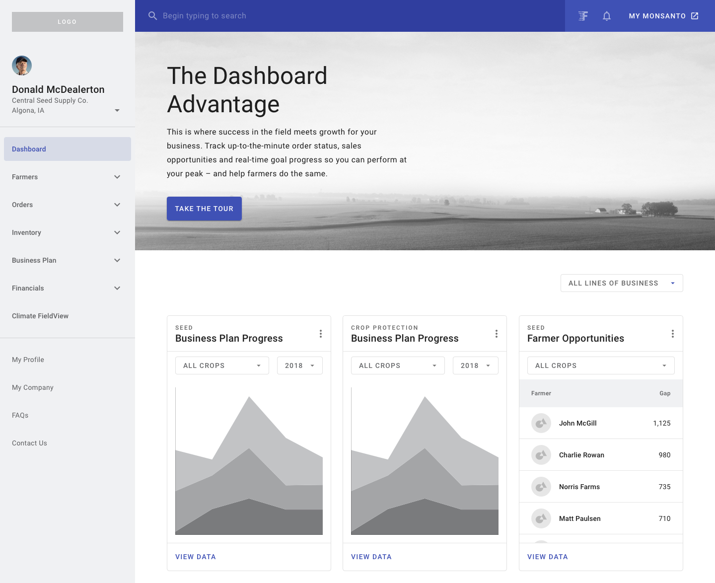
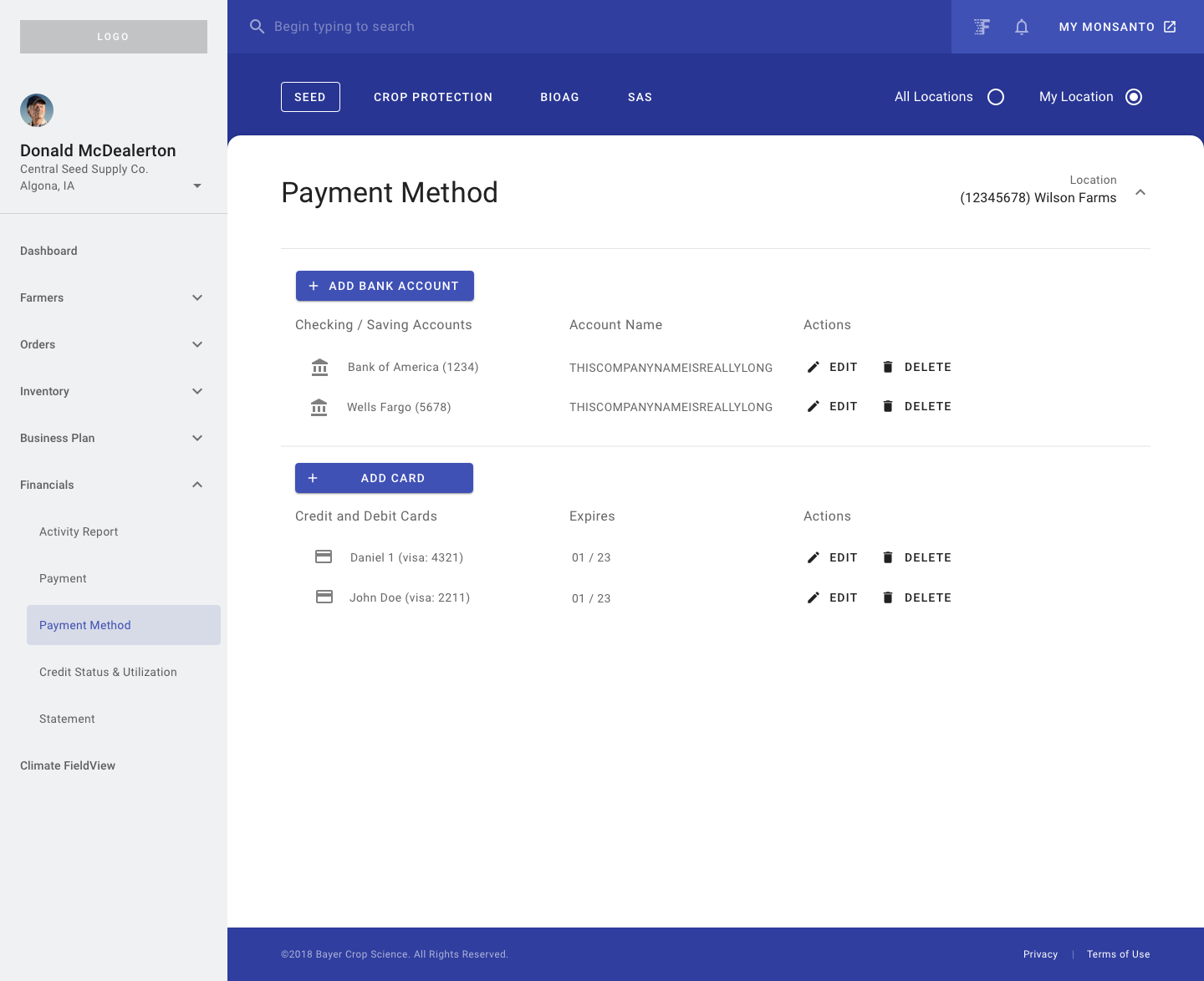
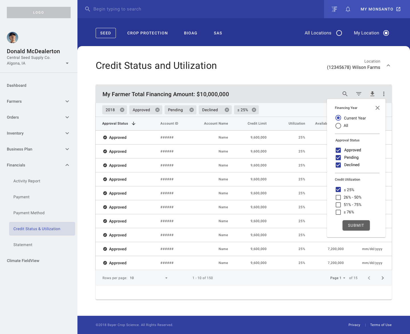
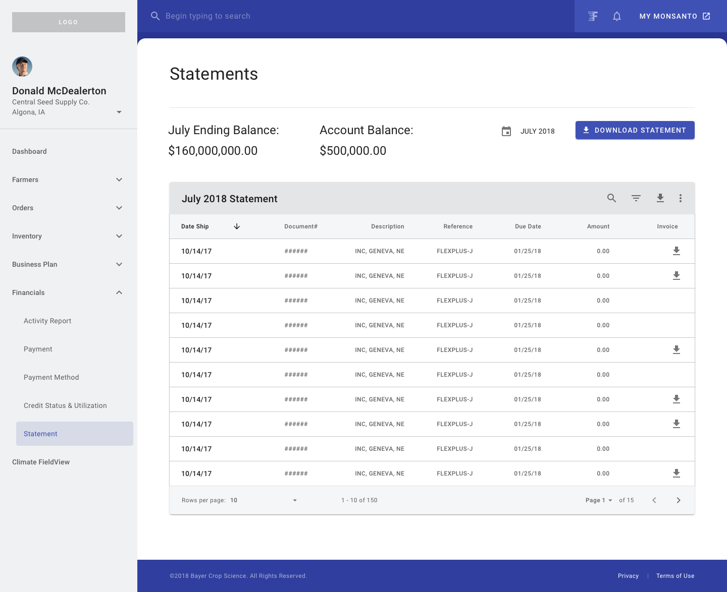
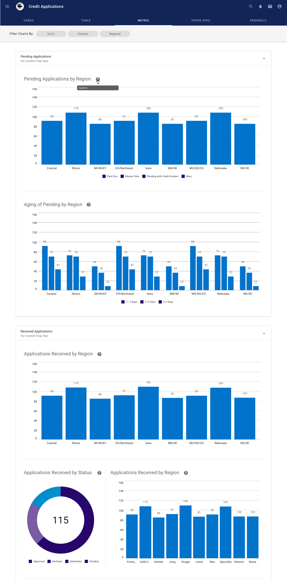
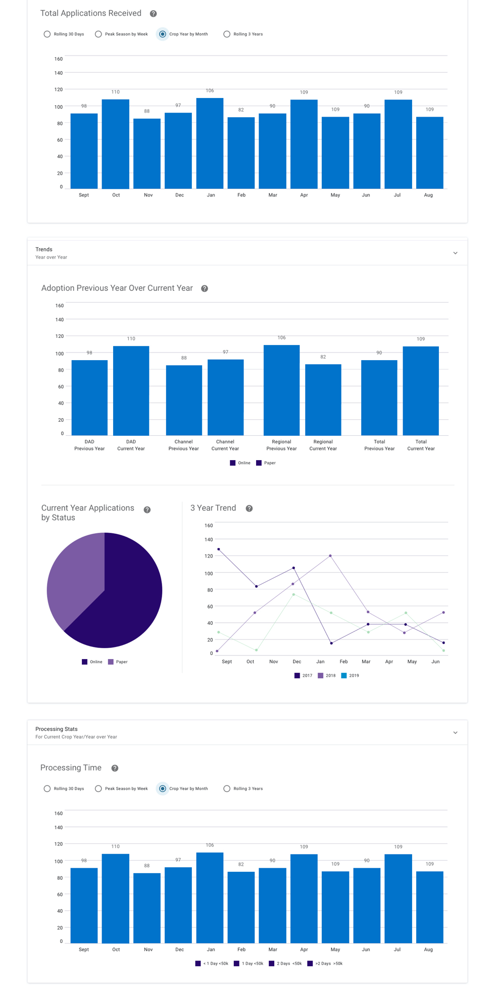
Bayer Crop Science, formerly Monsanto, invested millions in a new platform to foster trusted relationships with farmers and dealers. The Digital Finance project, part of a larger 3-year global program, offered various financial services like Invoice, Statement, Credit Monitoring, Online Payment, and Credit Application.
| SCOPE | DURATION | TEAM SIZE |
| Web App | 17 Months | 8 DEVs, 1 PM, 1 PO, 1 PD |
|---|
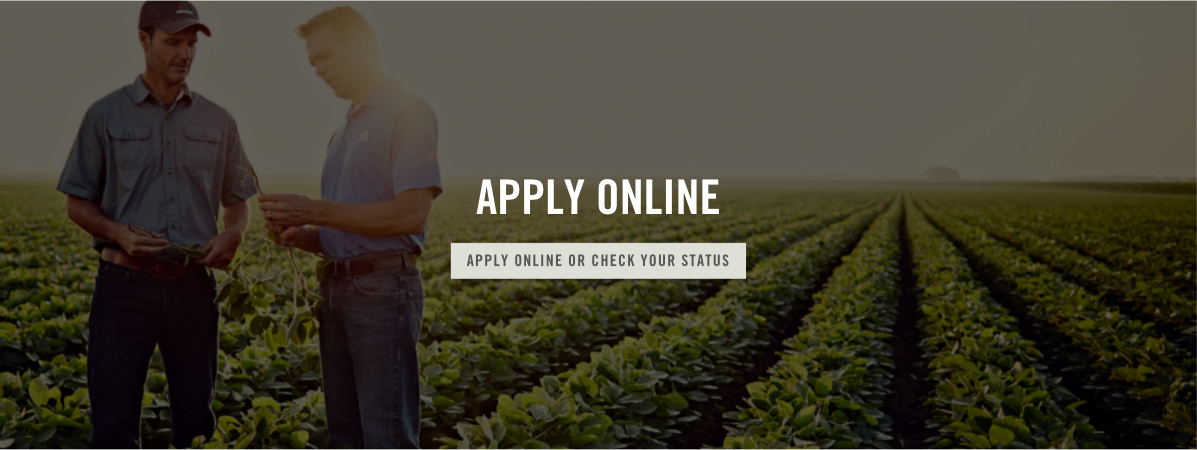
Final Designs
The main objective of this program was to provide a customer-centric buy-to-pay service that would benefit farmers and dealers. To support the multiple financial services, we streamlined many internal systems & work processes.
My Role
My role was a product designer in the finance teams. My team members are Product Owner, Product Manager, Designers, Developers, and Credit Analysts. I worked on the digital finance services from 0 to 1., and work closely with these partners to identify and solve problems that would drive customer satisfaction and improve business metrics.
Challenges
In brief, I faced three challenges in this case:
Requirements ≠ User needs
Stakeholders did not allow us to directly contact the end users in the early stage. To increase our confidence in meeting the most critical user needs, I brought early design concepts to the in-direct users, like credit analysts and finance experts, to validate certain assumptions. For example, the fact that I validated the Guest Payment workflow was not an urgent need for the end users since they prefer a specific person to log in to complete the task most of the time.
Cross Team Collaboration
Effective communication is critical in large-scale development projects. I made a point to meet regularly with stakeholders and cross-functional teams to ensure everyone was on the same page. This allowed me to focus on the top priorities and keep things moving smoothly.
Embrace Ambiguity
Dealing with complex systems can be daunting, especially when there are still many unanswered questions. However, I learned that it's important to have the confidence to let go of the details and keep a positive mindset. A positive attitude is helpful for me to achieve positive results.
Requirements ≠ User needs
A Closer Look at the Details
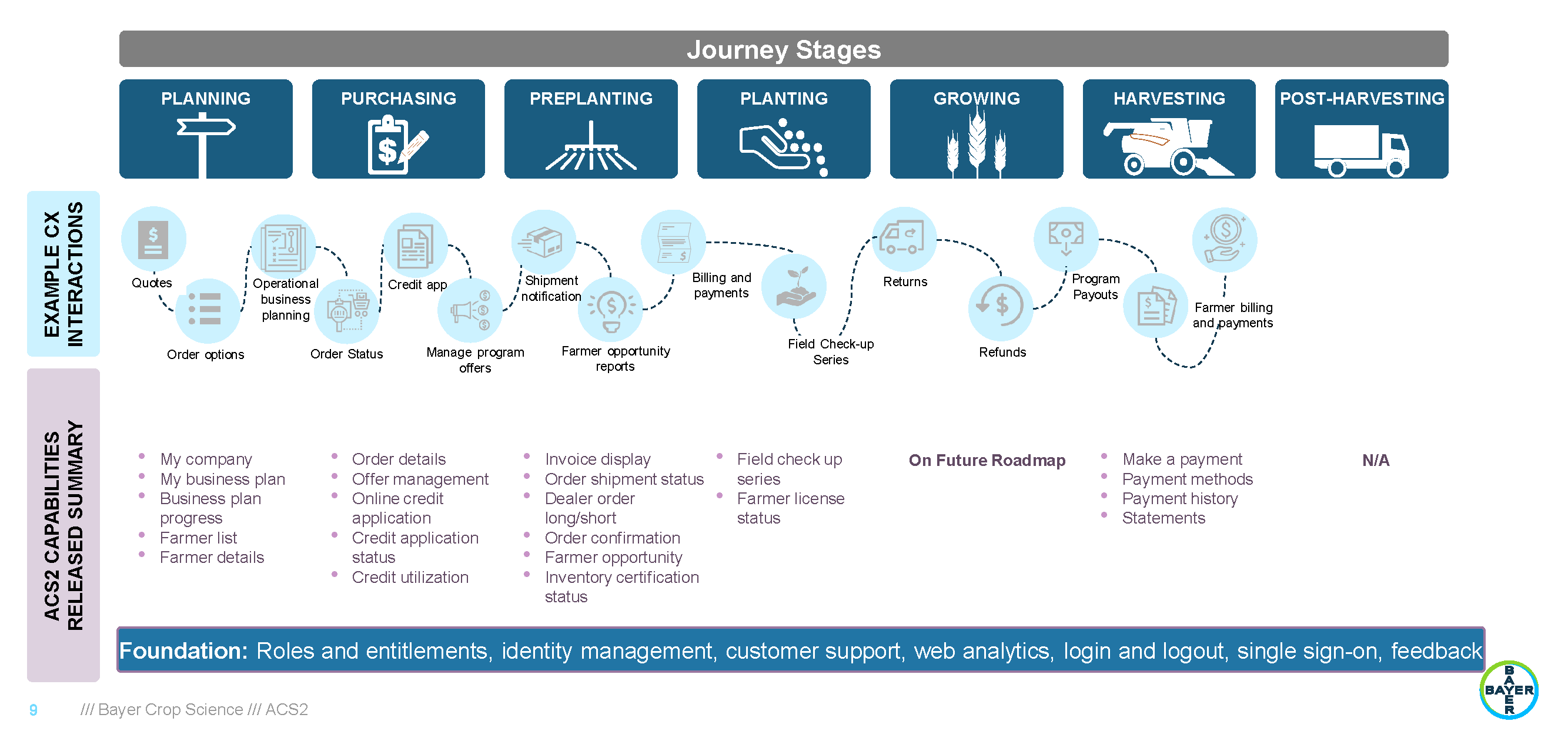
From planning and purchasing to planting and harvesting, farmers go through various stages. That's where the program comes in - it aimed to streamline the complex buy-to-pay process for farmers. And I played a critical role in ensuring that the financial services were integrated seamlessly into the larger journey and that farmers had a positive experience in the entire process.
Discovery Phase
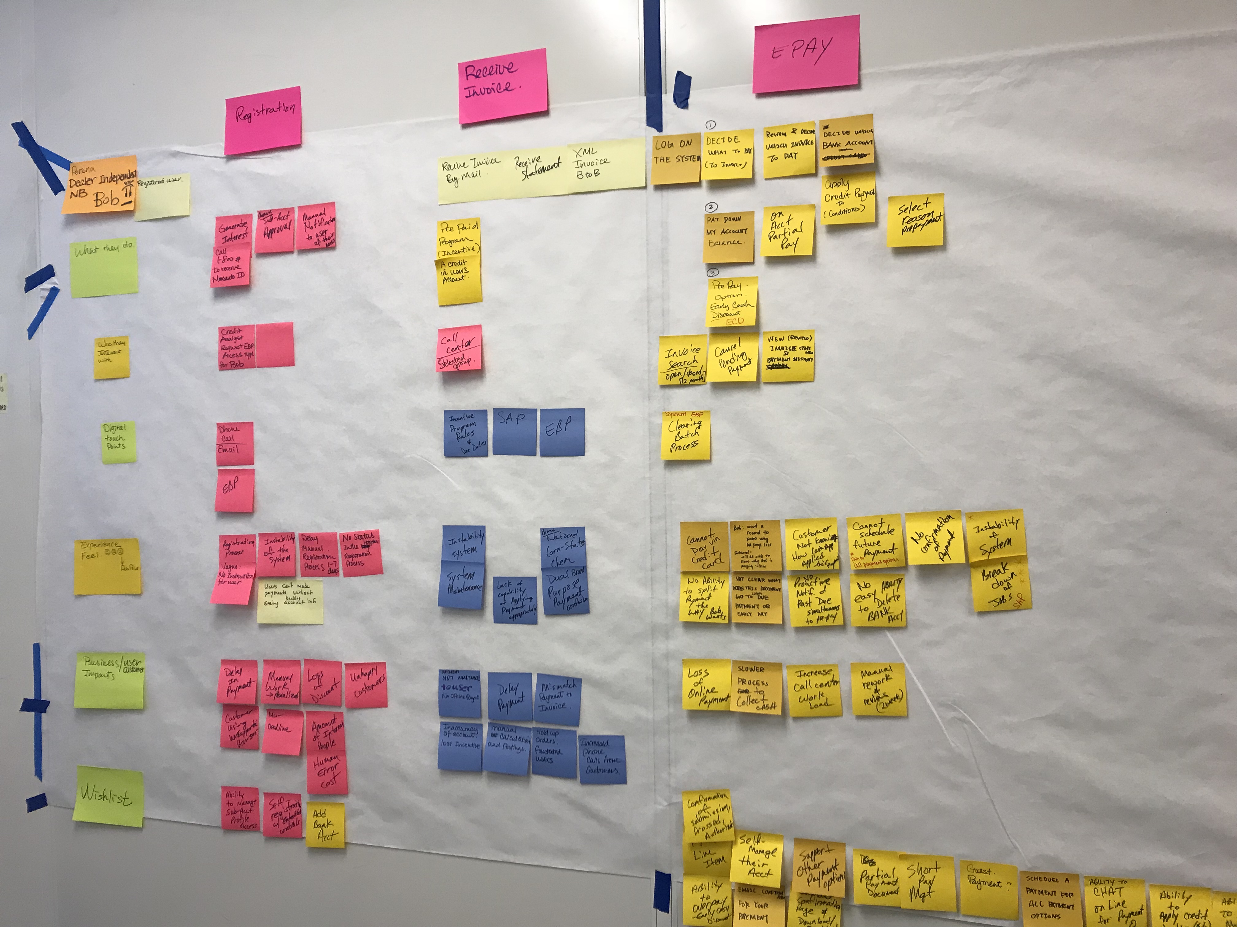
To understand the current US financing process and identify the target users and their needs, I worked closely with the Finance Subject Matter Experts who had a deep understanding of the entire financing procedure and dealt with end-users on a daily basis.
Through these workshops and discovery meetings with SMEs and stakeholders, I clarified two important things.
- The current financing process and Bayer’s strategic business goals
- Tri-brand customers were the primary users across all product lines
Collaboration
In this large-scale program, collaboration was crucial to our success.
To better understand our users,
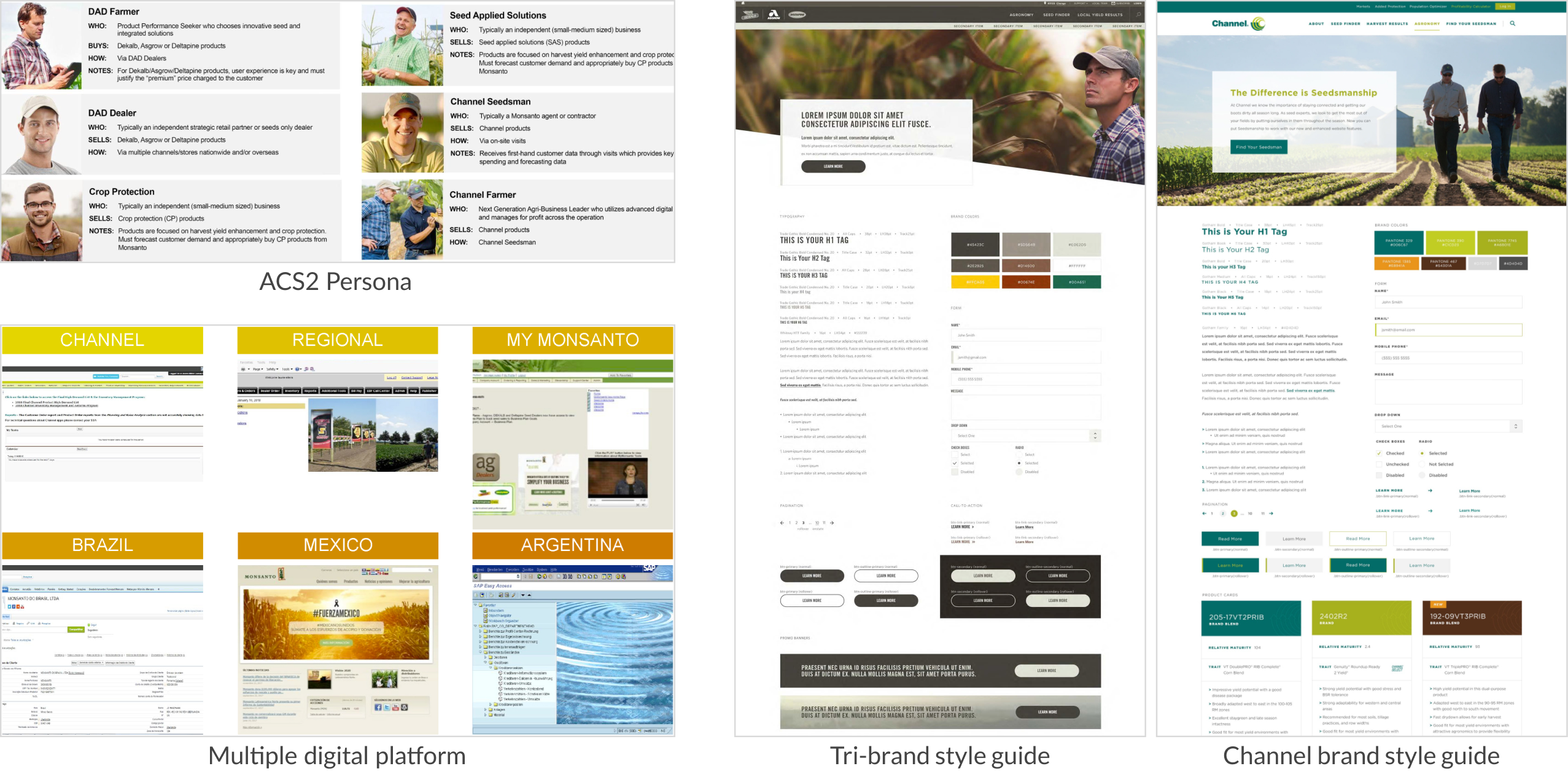
I consulted with a UX researcher who had been with the company for 30 years. Additionally, I worked closely with Finance SMEs to capture the differences in business processes across different markets and countries.
In terms of design,
I regularly met with an outsourced Design System team and the Customer Product team to review the product style guide and component patterns, ensuring a cohesive and consistent user experience across different services.
Online Credit Application
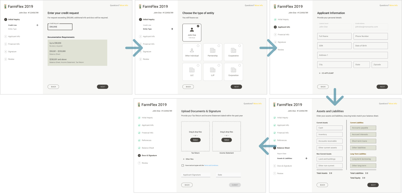
Many farmers required financing for their seed purchases. One key area of focus was the Online Credit Application service, which I will use as an example to illustrate the design iterations.
The development of an Online Credit Application service streamlined the credit review process. Integrated with other platform services, it accelerated the farmer's journey from the beginning of the purchase stage. Automation reduced manual intervention, enhancing efficiency and cost-effectiveness. Improved UX allowed users to submit applications and receive results more quickly.
Pain Points
- Manual delay
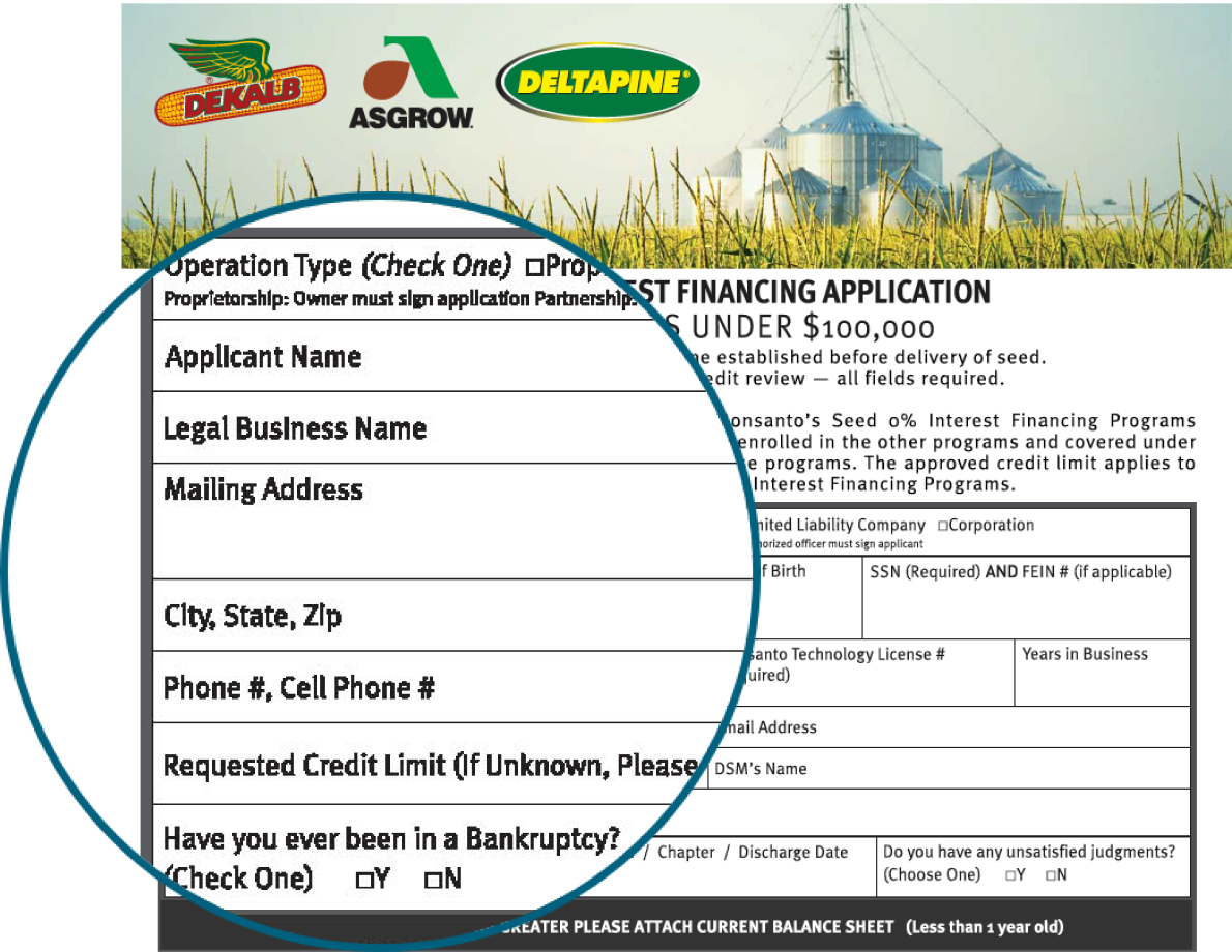
- Form frustration
- Inaccessible
Design Iterations
I brought early design ideas to meet with the Finance folks and the stakeholders for validating concepts and collecting feedbacks. Some examples for my design iterations:
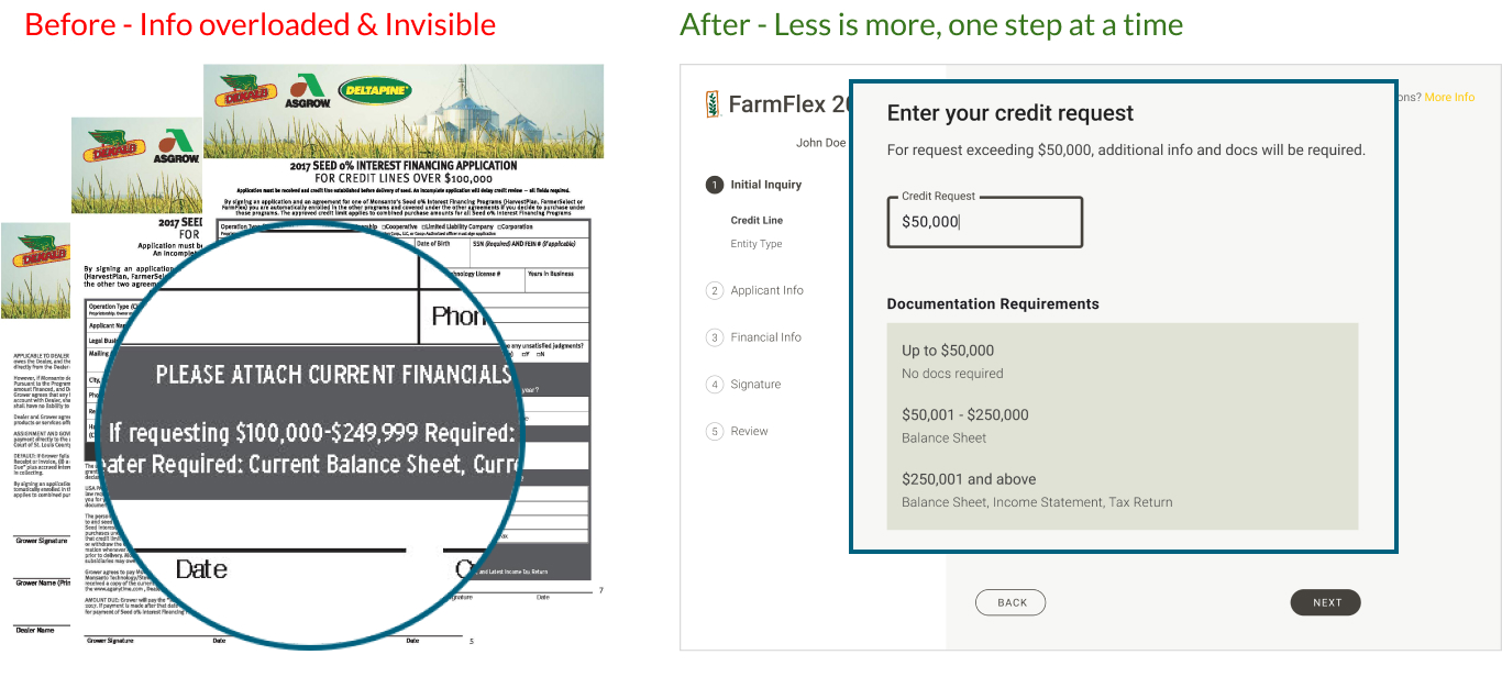
Example 1 - Simplified Tasks
To streamline the process, I redesigned the task into a series of steps based on 3 tiers of credit line requests. As you can see from the left, in the paper application, users faced the challenge of sifting through a lot of text to understand the requirements.
In my new design on the right: Users begin by entering their credit line request and viewing highlighted documentation requirements. It enables users to track completed steps and those remaining. By doing so, they focus on one session at a time without feeling overwhelmed.
Example 2 - Minimized Difficulties
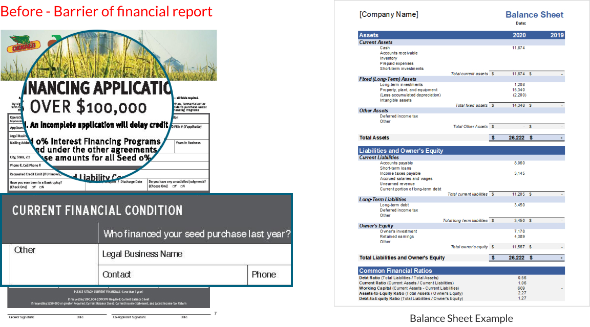
The 2nd example addressed the slow financing process. When requesting credit over 100K, credit analysts needed more info about financial capacity to make financing decisions.
To automate the the process, it required the applicant to input their assets and liabilities from the Balance Sheet. However, it was difficult for farmers to do so because it required accounting domain to fill that in.
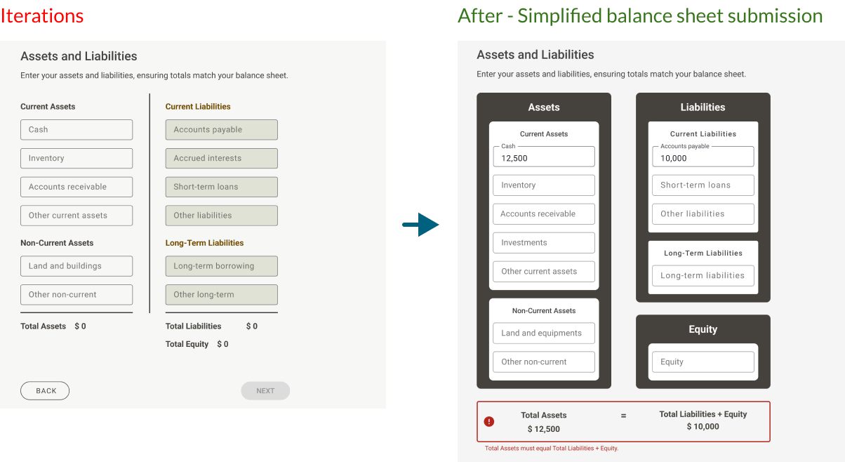
So, I need to design a simple way filling out Balance Sheet. My goal was to help farmers submit accurate financial information with minimal risk of error. In the initial design, the requirement was for users to fill out assets and liabilities information, and the system calculated the Total Equity for users to compare if it matches.
However, feedbacks indicated that this format differed from a standard balance sheet, and the Total Equity calculation was not helpful for identifying balance errors. After discussing with credit analysts, I redesigned the section. In the updated design on the right, users enter Liabilities and Equity together, easily following the balance sheet format. As users input data, a formula checks for accuracy and displays results for verifying.
These changes allowed farmers to complete the form accurately and confidently without needing additional assistance from Credit Analysts or banks.
Success Metrics
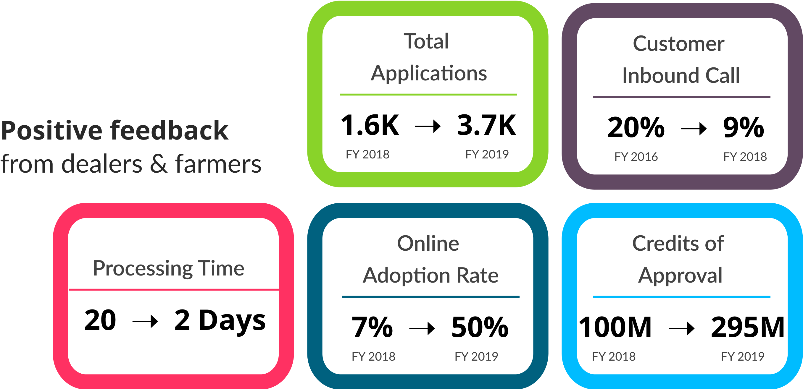
The online Credit Application launched in 2018, and we tracked several key metrics to assess the outcome.
- Process Time: 20 days → 2 days or less
- Number of Applications: 1.6K → 3.7K
- Credits of Approvals: $100M → $295M
- Online Adoption Rate: 7% → 50% → (some of the brands will stop providing paper application)
- Customer Calls Related to Finance: 20% → 9%
