Ascension ID
I led the design process of a Single Sign-On service, starting from understanding needs, defining the scope, visualizing ideas, and making it happen. Our goal was to create a centralized identity system, making it easy to access Ascension services with just one set of credentials.
| SCOPE | DURATION | TEAM SIZE |
| Web & Mobile App | 10 Months | 6 DEVs, 1 PM, 1 TPM, 1 UXD |
|---|

My Role
I played a crucial role in the team, taking charge of the scalability strategy and design for both web and mobile services. The diagram below illustrates the collaborative efforts with team members. During development, I crafted all key deliverables, fostering internal communication with stakeholders such as PMs, Business Analysts, UXR, Designers, and Developers.
Focusing on features Goals
The business goals and metrics for this product were initially unclear as there wasn't a PM on the team from the beginning. My top priority was to ensure that user objectives and the product strategy were at the forefront of every feature. I led collaborations in creating the product roadmap and service blueprints, always considering users' best interests throughout the entire process with stakeholders. Additionally, we defined the primary users as patients (customers) based on user numbers and overall usage.
Challenges
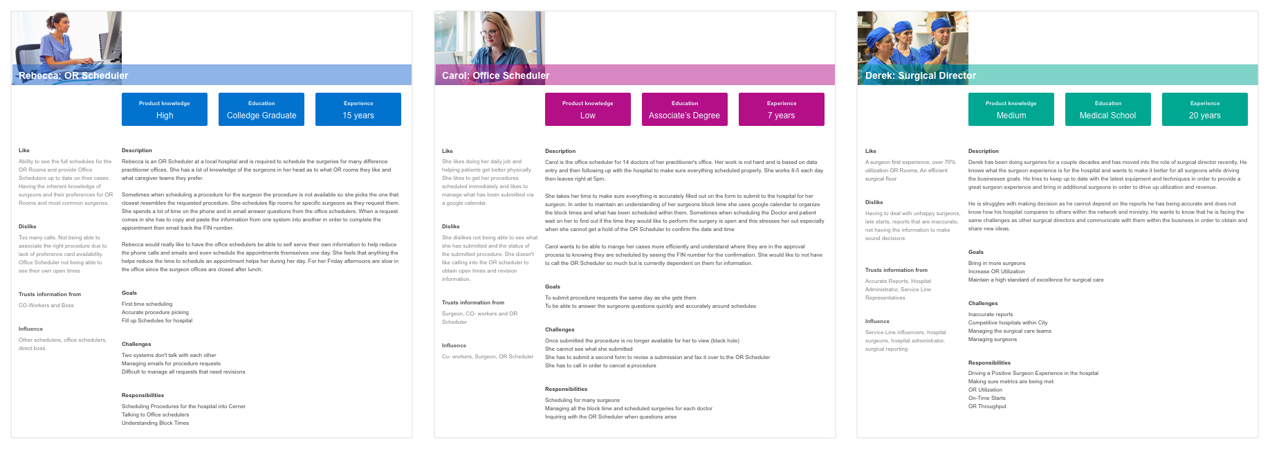
Ascension ID faced intricate technical challenges while supporting more than 300 Ascension services. It was linking up with various workflows; each user's journey to the platform came with different intentions. For instance, Clinical staffs involves clinical activities like surgery and diagnosis; patients includes personal activities such as appointments and reports.

Technical Complexity
There was a lot of tech stuff in the domain while integrating with over 300 different Ascension services, requiring clever technical solutions to ensure compatibility. To address that, I dug into a 40-page tech spec and checked out some engineering docs to figure out what's possible and what's not.
Customer-facing vs. Internal-facing
Ascension ID was designed to offer a patient-centric experience as part of the product strategy. However, when the PMs were developing the roadmap, they decided to launch Ascension ID first with an internal app - Surgical Tracker.
To gain a deeper understanding of Surgical Tracker and how users roll with it, I I picked the brains from the Surgical Tracker team. For instance, I learned that schedulers mainly need to log in to the Ascension scheduling system to reserve OR room. On the other hand, managers focused on assigning and giving access to others.

Storyboard
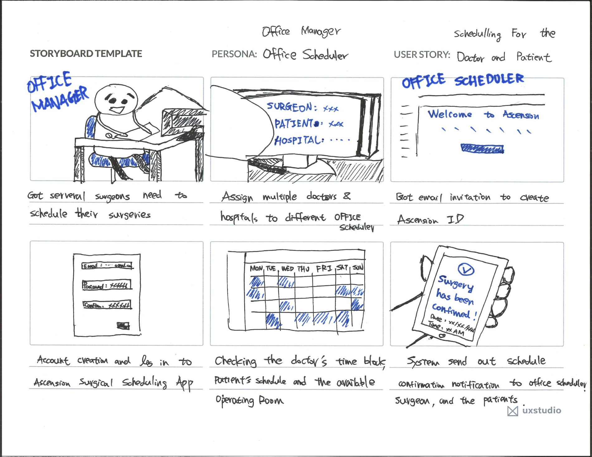
In order to provide better engagement with the persona and see them as ‘real’, I created a storyboard to illustrate the interaction between Office Scheduler, Office Manager, and Ascension ID.

“Design is not just what it looks like and feels like. Design is how it works.”
Design Process
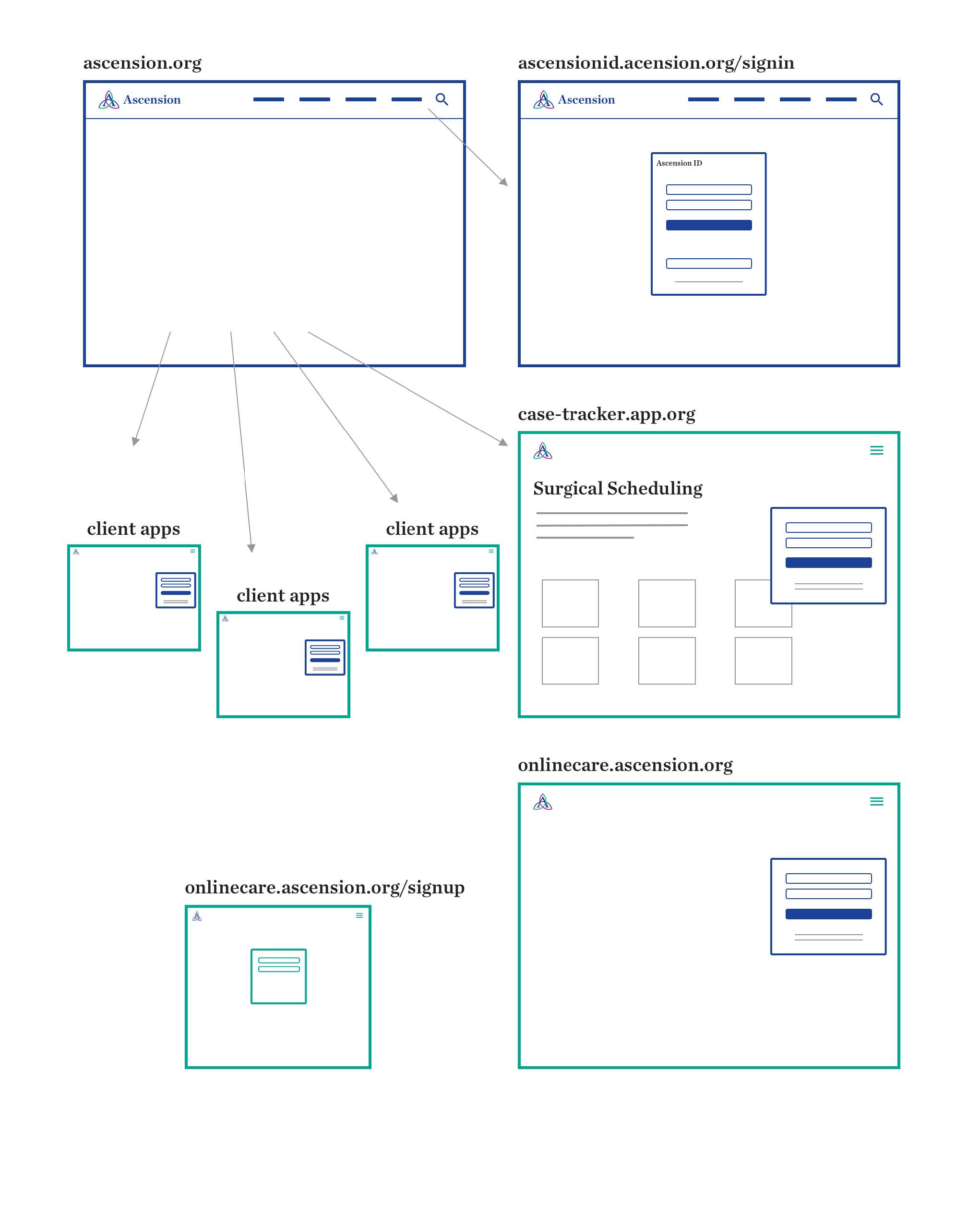
I used drawings to show how Ascension ID works. The main thing was to make sure that the important features connect with what users care about and do in the Surgical Tracker app (3 personas). To make sure everyone was on the same page, I brought the PMs and Devs to the ideation stage frequently as well as the Surgical Tracker team.
Seeing pictures and stories about users made everyone think about users while we built things. It also helped the team decide what features were most important based on users' needs. This way, everyone agreed on what we were doing and what was possible.


Iterations
Low Fi → Hi Fi
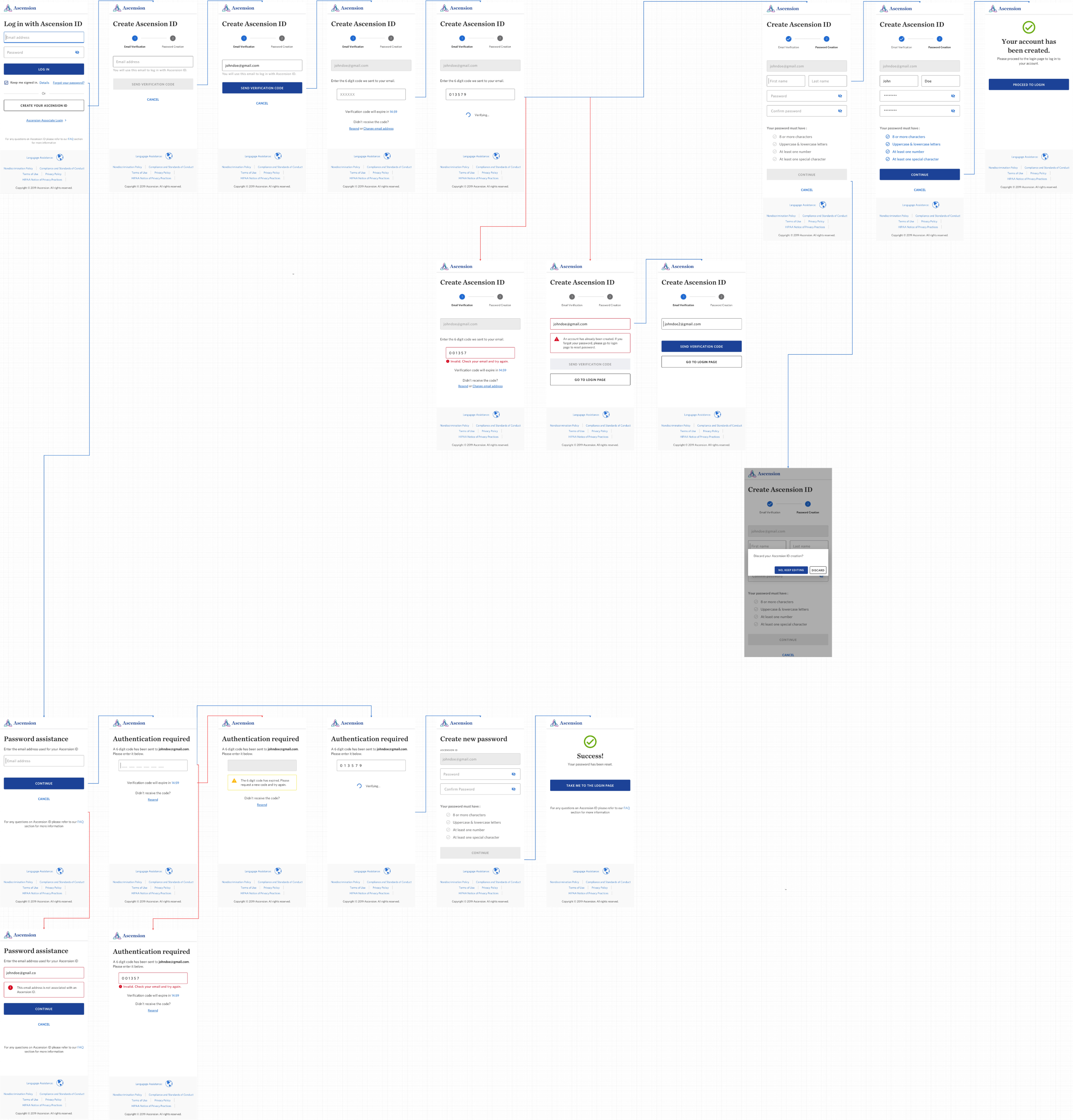
The fundamental functions were straightforward, such as Log In, Register Account, and Reset Password. Once I understood how designs addressed users' problems in the storyboards and user flows, I could begin designing mid- to hi-fi mockups that demonstrated the flow and interactions between screens.
“Feedback is the breakfast of champions.”
Improving Design with Feedback
I conducted design critiques and frequently shared my designs with peers so that I could understand limitations and possibilities to improve design.
For example, a potential issue arose in the creation flow, specifically in preventing reset password scams. To address this, I delved into technical mechanisms and industry standards, collaborating with developers to review the flow step by step. Considering the overall UX and the constraints, I rewrote the error message to better inform users about what to do in this situation, even though it may not be the best solution.

As the product grew, the scope also expanded, and the design needed to be reconsidered...
The initial scope focused on designing for customer-facing aspects. Yet, the new identity system would support not only patient-facing and associate-facing services but also other future hybrid applications. Therefore, I had to reconsider the trade-off of the language we were using between external and internal on the main login screen.

Because we were now considering more than just patient-facing apps—also looking at services for associates and future hybrid applications—I came up with four different ideas based on this change in strategy.

User Testing
To quickly validate my concerns, I recruited volunteer participants internally and collaborated with two research partners to conduct testings in a week.

Key Highlights and Insights
- The participants were confused about what Ascension ID was and how it related to their work email credentials.
- The participants had the same confusion across all versions. However, during versions B, C, and D testing, participants could quickly learned to click on 'Log in as an Ascension Associate' and 'Associate Log In' buttons to navigate to the correct page
Solution
Best Practices
No matter which email was used, the login screen remained consistent; there was no longer a need for a separate Ascension Associate Login link. However, some back-end integrations were pending before establishing best practices
Considering the efforts to establish the best practice and the value to Surgical Tracker app users (which has a smaller user base of only a few dozen people), the product team and I devised a short-term solution for Ascension associate-facing-only apps.
Short-term Solution:
The internal-facing-only app sent users to a screen to use Ascension credentials, cutting a step for internal users and solving the navigation confusion as well. Plus, it still securely supported these internal apps without letting users be aware of it.

Deliverable
As we kept refining things, features were solidified and transformed into screen flows. The high-fidelity screen flows used blue lines for moving forward and red lines for going back – a visual guide to keep things clear and user-friendly throughout the process.

Results
No more juggling logins—just one set of credentials
5 apps integrated ; 750+ IDs registered
Before Ascension ID, patients and staff dealt with the headache of using different logins for various apps. Even though I left before it was completely finished, we seamlessly integrated it with 5 apps and registered over 750 IDs.
Through the iterative design process and close collaboration with the Product, Research, and Design teams, we established a robust infrastructure for the Ascension ecosystem. To keep things in line with best practices, Ascension will continue conducting user tests with clinicians, associates, and patients, gathering their feedback.
Example Customer Quotes:
“I’m glad I just have to remember one password for all of my Ascension stuff.” “I authorized my son as a Caregiver so he can manage scheduling my appointments.” “I enabled two-factor authentication since I’m super careful about who gets access to my medical records.”
